A Shadowy Topic: Drop-shadows in Your Webpages
by Nathan Rohler
Shadows are one of the primary methods for adding perspective and depth to your webpages. Obviously, the web is a two-dimensional medium (at least for the time being!). Because of this, we have to use effects like reflections and shadows to help create visual delineations between different page areas, highlighting some portions of a page and reducing the prominence of others. In this article, I'm going to cover box shadows – these are the shadows that appear behind block-level elements such as <div>s.
CSS3 Saves the Day
Back in the good ol' days (circa 2005), adding shadows behind elements was a complicated proposition. You had to create an image for the shadow, split it up into corner and edge pieces, and add lots of extra markup to your page to make the shadow automatically track the edges of the box. If you didn't have a solid color behind the box (e.g. you had an image or gradient background), you had to use a transparent PNG image. But some browsers didn't fully support transparent PNGs, so you had to add even more code to work around this limitation.
However, in the CSS3 specification (the latest version of the CSS standard), things became much simpler. Native support was added for the browser to render shadows behind elements based on a new CSS property, box-shadow. Over the last few years, we've seen browser manufacturers gradually implement this standard. Naturally, it has been Internet Explorer that has lagged behind; only IE version 9 supports the box-shadow property. However, with the market share of older IE versions waning and other browsers fully supporting box-shadow, we can now use the box-shadow property. The code will simply be ignored by older IE versions, and those visitors will see a fully-functional but less-pretty version of your site.
Note: If you are feeling technically adventurous, you can simulate box-shadow in older IE versions via the non-standard filter property. In this article, however, we'll only be focusing on using the new CSS3 property.
The Code
Here's the basic syntax for box-shadow:
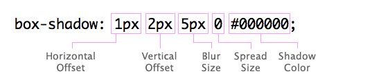
It's difficult to visualize all of those properties. That's why I've created a visual tool below. But first, let's cover how you actually use this code in your page.
Let's say you have a <div> with an id of myBox:
<div id="myBox">
   Some text in the box
</div>
In reality, this box might have anything and everything in it – including other elements. To add a border and shadow, here's the CSS we would add in our stylesheet:
#myBox {
   border: 1px solid #999;
   box-shadow: 1px 2px 5px 0 #000000;
}
But, of course, it's not quite that simple. To ensure compatibility with older versions of the browsers that do support box-shadow, we need to also specify -webkit-box-shadow (for Chrome and Safari) and -moz-box-shadow (for Firefox). The values of the properties are the same; only the names are different. These vendor prefixes were the way that browsers initially implemented CSS3 features, while the standard was still in flux, and they are still needed for backward compatibility. We need to put these properties before the official box-shadow one, so that the official property always takes precedence. (Later properties override earlier properties.) So, here's our final code:
#myBox {
   border: 1px solid #999;
   -webkit-box-shadow: 1px 2px 5px 0 #000000;
   -moz-box-shadow: 1px 2px 5px 0 #000000;
   box-shadow: 1px 2px 5px 0 #000000;
}
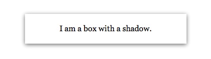
As mentioned before, this code will work in all browsers except IE8 and earlier. Here's what it looks like in your browser:
Again, if you're using IE8, then you won't see any shadow. But the border is still there, so losing the shadow is an acceptable concession in most situations.
A Generator
To help you learn more and save time when creating box shadows, I've created a little tool for visually creating a shadow. Just use the controls below the preview to change the shadow configuration and color:
Horizontal Offset: Vertical Offset: Blur Size: Spread Size: Color:
Output Code:
As with any other CSS, you can add this code directly to an element via the style attribute or put it in your stylesheet file. For example:
<div style="-webkit-box-shadow: 0 4px 15px 0 #000000; -moz-box-shadow: 0 4px 15px 0 #000000; box-shadow: 0 4px 15px 0 #000000;">
   My shadow box
</div>

-or-

In HTML page:
<div id="bla">My shadow box</div>

In stylesheet file:
#bla {
   -webkit-box-shadow: 0 4px 15px 0 #000000;
   -moz-box-shadow: 0 4px 15px 0 #000000;
   box-shadow: 0 4px 15px 0 #000000;
}
Tip: Note that you can also use colors in the rgba format like this:
rgba(0, 0, 0, 0.8)
That would translate to black with 80% opacity.
Conclusion
In this article, I've introduced you to using the CSS3 box-shadow property. CSS3 allows us to add beautiful visual effects such as shadows to our pages with very little code. You can learn much more about CSS, including the new features of CSS3, on the Mozilla Developer Network.
Have fun creating drop shadows!