The Basics of Overlaying Content
by Nathan Rohler
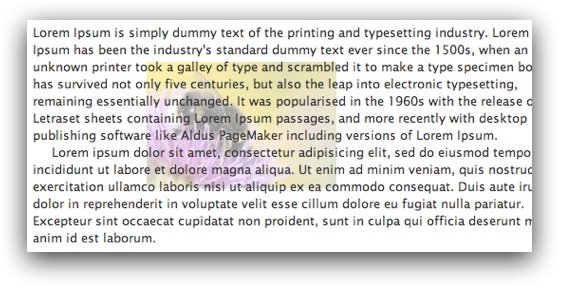
Suppose you have a content area on your page. This area might contain text, images, tables or any other type of HTML content. If you want to add a simple background image behind this content, that's easy – you just add a CSS background-image to the container <div>. But what if you want to use more complex content as the background? For example, suppose you want to place a subtle images-only slider created with EasyRotator behind a section of page content:

This type of configuration requires a little more code, but is still relatively simple once you learn what's needed. Best of all, as we implement this effect you'll start learning about the powerful CSS position property and the many possibilities for how it can be used.
The Idea
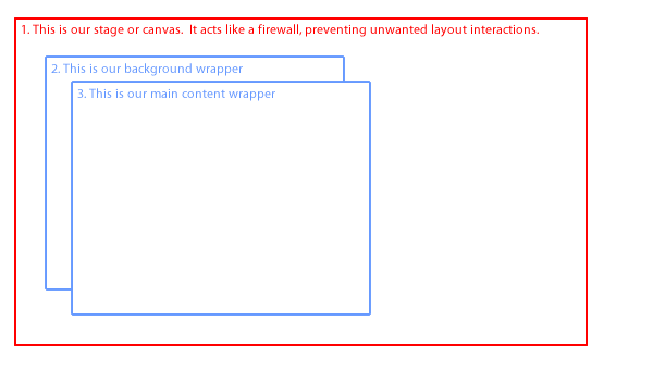
First, let's take a brief look at how we will arrange our content and containers:

Each of these three containers is a <div>. The first (#1) is the outer wrapper <div>, which acts as our "stage" or "canvas" of sorts. We will apply CSS relative positioning (via position: relative;) in order to allow management of the stacking of its sub-containers; more on that in a moment.
Inside of the main container, we have two sub-containers that are stacked on top of each other. The first (element #2 in the diagram) holds our background content. The second (element #3 in the diagram) holds the main content with which we're starting. The background holder <div> is positioned absolutely, which pulls it outside of the layout flow. In combination with the relative positioning of the main container, this absolute positioning allows the background area to overlap the content area. By applying relative positioning to the content and z-index values to both the background and content wrappers, we make the content appear on top.
I realize all of this might be a little confusing, so let's dive into the code – which is actually pretty simple.
The Code
As I mentioned earlier, you can start with any type of HTML content. It makes no difference, so we'll pretend that we have some text and a very basic table:
<!-- Begin content block -->
<p>Lorem ipsum dolor sit amet ad infinitum. Enjoy our newest data:</p>
<table>
  <tr>
    <td>Some data</td>
    <td>Some more data</td>
  </tr>
  <tr>
    <td>Some data</td>
    <td>Some more data</td>
  </tr>
</table>
<!-- End content block -->
To create a background area that floats behind this content, we add the following additional <div> tags with special CSS applied via the style attributes:
<!-- Begin stage wrapper -->
<div style="position: relative;">

  <!-- Background wrapper: -->
  <div style="position: absolute; z-index: 1; left: 0; top: 0;">
    <!-- All background content goes here... -->
  </div>

  <!-- Content wrapper; all original content goes inside of this div: -->
  <div style="position: relative; z-index: 2;">
    <!-- Begin content block -->
    ... all original content is in here ...
    <!-- End content block -->
  </div>

</div>
<!-- End stage wrapper -->
Let's review each piece now that you can see the actual code.
First of all, there is the main container/wrapper div with position: relative. This allows us to use position: absolute on its first child element, which is the background container. By using left: 0; top: 0; I have specified that the background should be aligned exactly to the top-left corner of the content; but this can easily be changed. For example, suppose that you want the background to be 200 pixels to the right and 100 pixels down from the top-left corner of the content. In that case, you would instead use
left: 200px; top: 100px;
You can now place any imaginable type of HTML content within the background wrapper – subtle typography, images, rotators, even videos (not recommended!).
Next, we have the content wrapper. It has position: relative; applied, which allows us to manually control the stacking order via the z-index property. Inside of the wrapper, we place the original content that we started with.
Note how we control the overlapping of the two inner containers. The first has a z-index of 1, the second a z-index of 2. This ensures that the background always appears behind the content since it has a lower z-index.
Tip: If you're unfamiliar with the z-index property and how it works, see this other article we recently published: The Z-index Property: How to Control Stacking in Your Webpages.
Live Demo
Here's the finished effect, using a rotator as the background content behind some plain text:
Overlays Are Attractive
Lorem ipsum dolor sit amet, consectetur adipiscing elit. Donec varius aliquet magna et elementum. Donec lacinia cursus placerat. Maecenas pulvinar odio id nibh lobortis bibendum. Suspendisse potenti. Cras a lorem lorem, eu scelerisque lorem. Cras in risus vel metus auctor viverra accumsan quis metus. Nunc porta scelerisque accumsan. Mauris non porttitor justo. Ut vitae pellentesque arcu. Nunc commodo aliquam elementum. Vivamus pulvinar erat a sem tristique auctor. Donec id diam sed neque faucibus pharetra et vitae orci.
Aliquam at massa sit amet leo ornare faucibus. Aliquam rutrum ipsum posuere arcu posuere non porttitor nibh luctus. Sed suscipit, nibh et elementum bibendum, elit nisi sodales tortor, vel lacinia mi arcu non augue. Nunc in eros id orci consectetur imperdiet eu vel massa. Donec fringilla magna non dui mattis euismod. In nec diam augue, vel tristique mi. Duis viverra nibh et eros aliquet nec dapibus felis gravida. Etiam accumsan, ipsum quis ornare tincidunt, tellus sapien dapibus est, id dictum dolor lectus interdum nibh. Sed leo augue, lobortis ac tincidunt sit amet, tincidunt interdum purus.
Integer velit nisl, tincidunt vel mattis sed, vulputate quis ligula. Suspendisse interdum ante ut est sollicitudin malesuada. In blandit tortor vel mi sollicitudin at dignissim diam lobortis. Aenean eget est felis, at venenatis neque. Aenean vitae mollis diam. Cras quam magna, pretium eget volutpat ac, tempor ut dolor. Sed sollicitudin porta dictum. Pellentesque habitant morbi tristique senectus et netus et malesuada fames ac turpis egestas. Praesent non sapien non neque rhoncus posuere vestibulum eu felis. Aenean ac sapien nec orci facilisis suscipit ac sit amet ligula.
Your friend,
Einstein
Turning It All on Its Head
We've been looking at this technique from the perspective of adding content behind the main content. But it can be used in the exact reverse way – to float content on top of existing content. You simply set the z-index of the background holder to be a higher value (e.g. 3 instead of 1), and it becomes a container for floating watermarks, decorations, or content of any other type on top of your main content. Keep in mind, though, that you can't click on any links in the lower content if there is content floating on top of it.
Conclusion
You've just learned some of the basics of using absolute and relative positioning together to overlay content in your webpages. In future articles, we'll continue to talk more about using the powerful position and z-index properties together to apply advanced layout techniques.
Thanks to the specific technique we covered in this article, you can now add any type of background content behind any existing section of content in your page. How will you use this effect in your webpages?


