Some Design Rules are Made To Be Broken
by Faith Towers
It is important to know the rules before you consider breaking them! What do you have left once you have disregarded the fundamental principles of graphic design? You have instinct. And if you are a good designer, then you probably have an innate instinct for visual taste. That intuition must be used to decide whether a rule should be broken in the first place. It's important to note that none of the suggestions I'm about to make applies to every single situation. Nonconformity is a choice that should be made with caution – but it's one that can produce exceptional results. Sometimes ignoring the rules can inspire us to think outside the box. Good design is ultimately based on visual taste, and no rule or guideline can replace that.
The Grid System
The grid system is a very popular method, taught in most basic graphic design classes since the 1970s. After World War II, designers Josef Müller-Brockmann, Emil Ruder and Max Bill started questioning the typical page layout style of the time. They felt that it was disorganized, so they began devising a flexible system of layout that was based on a series of lines that would guide a designer toward a balanced final design. The grid system recommends that all elements of the page be aligned with one another through a system of evenly spaced vertical and horizontal lines.
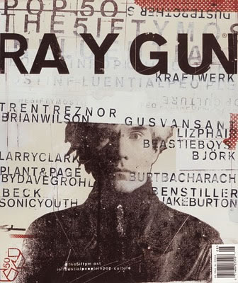
The grid system can be a helpful starting point, but isn't always an effective tool for every layout. Some of the most revolutionary designers have ignored the grid system altogether. David Carson was one of the first designers to successfully disregard the grid system. He ignores the vertical and horizontal planes completely, relying heavily on overlapping text, images and diagonal lines. His innovative style defined the so-called "grunge" movement, and Graphic Design USA magazine named him one of the top five most influential designers of the current era. His ground-breaking indifference to the grid system shows that the breaking of rules can help fuel creative expansion.
White Space
White space, or negative space, is the area not occupied by page elements such as text, images and drawings. It can be used strategically to separate unlike items and group similar ones together. White space is not necessarily white, but rather empty space in general. Most design instructors will tell you that white space should be used in moderation, primarily as a tool to divide information. However, empty space draws attention to whatever it surrounds. If the goal of an advertisement is to bring attention to a product, the use of excessive white space can be a valuable asset in doing so.
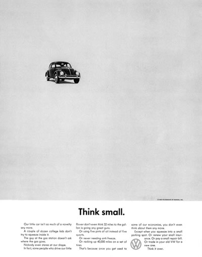
William Bernbach, a famous twentieth-century advertising creative director, led a number of successful ad campaigns that exemplified this point. One of his campaigns for Volkswagon, called Think Small, consisted only of a petite image of a Volkswagon Beatle in the top left corner of the ad and a small block of text at the bottom of the page. This was meant to emphasize the car's simplicity, countering the typical information-heavy car advertisements of the time. The ad was considered effective, garnering much-needed attention and business for Volkswagon during a time when the company was still often associated with Nazi Germany. This shows that ignoring fundamental guidelines about white space can sometimes achieve positive results.
Symmetry
Perfectly centered compositions or those with mirror images are considered to have symmetrical balance. It is often taught that designers should avoid symmetric alignment in a layout. This may be true in certain circumstances. For example, a large block of text rarely looks good center justified. But there are many instances when a symmetrical balance can be an effective design technique.
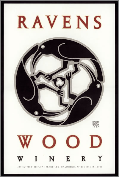
David Lance Goines, an American designer and printing entrepreneur, is well known for creating symmetrical poster designs. The success of his work is due in large part to his center-aligned layouts, which relied heavily on symmetry. For Ravenswood Winery, one of his most well-known clients, he created a symmetrical wine bottle label consisting of a trio of ravens intertwined with one another. The layout feels almost hyper-balanced, giving it a memorable quality that would not be as effective without that line of symmetry running down the center of the piece.
Use No More Than Two Fonts
As a general rule, it is best to avoid using numerous fonts. The effectiveness of one typeface comes from its relationship with another, so when too many are used, it can detract from the overall success of the piece. But if you can understand why this rule exists, then it is possible to ignore it and create an appealing piece of design.
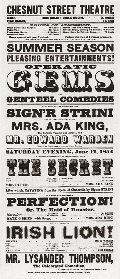
Nineteenth-century wood-type posters and playbills were known for displaying multiple typefaces within one composition. Many of these posters were successful despite breaking the rule, because the designers paid particular attention to the way each font interacted with the others. Similar proportions and colors gave the multi-font posters a sense of unity. Many contemporary designers still reference these classic designs in their work, and the era is heralded as an important time in the history of graphic design.
Pick Colors That Complement, Not Detract
Color theory studies show that complementary colors are the most appealing to the human eye, so most graphic design students are taught to limit their color palette to one or two complementary colors. But sometimes creating an eye-catching layout is more important than making an appealing one. Some of the best designs combine what are called "discordant" colors, creating a mix of colors so jarring people are drawn to it. Color should be used to emphasize importance, not to decorate the page. Using this logic, the quantity and hue should not matter as long as they are used effectively.
Legendary designer Milton Glaser has tended not to conform to the rule of using only a couple of complementary colors. His work is colorful, filled with uncomfortable combinations. His choices are so unusual that the viewer notices the layout, while it might otherwise be overlooked without those bold hues. In his renowned Bob Dylan poster, he pairs maroon, magenta and a host of other colors. Despite his disregard for traditional graphic design rules, he created a successful poster that perfectly represented both the man and the era. In fact, the piece was reportedly designed for a book jacket originally, using only blue and tan instead of the colorful version that everyone has come to know and love. Bob Dylan himself rejected that design. Years later, the same layout in all its glorious color was used on the now-famous poster. This proves how much of an effect discordant color can have.
Script in All Caps
Another common graphic design lesson is the advice to avoid capitalizing a whole line of text. Because the cap height of all the letters is the same, it is more difficult for the reader to decipher between each letter. The argument is that this makes the viewer less likely to bother to read the text at all. This is sound advice for long lines or entire blocks of text, but capitalization can be very effective in other instances.
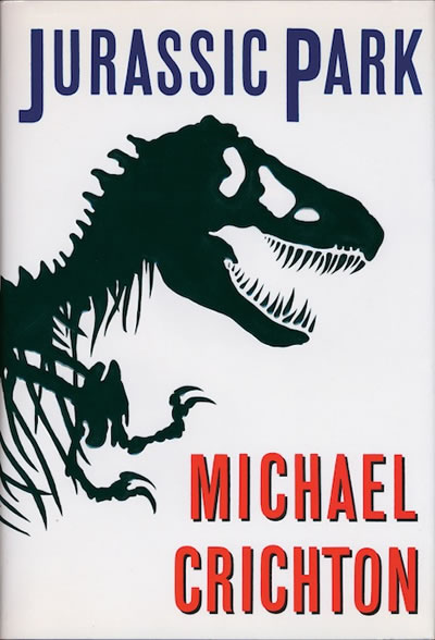
Uppercase words slow people down, and they are often perceived as visual emphasis. These are reasons that they can also be used to a designer's advantage. Famous book designer Chip Kidd favors the use of his "caps lock" key. He has designed recognizable covers for books such as Jurassic Park, No Country For Old Men and Possible Side Effects. In the case of a book jacket, using all caps to emphasize the title is an appropriate and advisable strategy. A memorable book deserves an accentuated title.
Conclusion
Many fundamental graphic design rules are built on solid foundations, and budding designers should follow these guidelines until they are familiar with the reasoning behind them. But just because they are called "rules" does not mean that they absolutely must be followed. In graphic design, "right" and "wrong" do not exist, because every single design problem is different. Using your aesthetic intuition to gauge whether your design is effective is more important than whether or not you have followed all the traditional guidelines. The next time you are inclined to assemble your layout in a grid, try jumping outside of the confines of those right angles… you may be happily surprised by the result.
