How to Mix and Match Fonts Effectively
by Faith Towers
Introduction
Last time, we looked at the wide world of fonts that are now available for the web, thanks to web font services. While this incredible selection enables delightful creative possibilities, it can also be easy to get carried away and design overdone typographic kaleidoscopes that leave viewers disoriented rather than attracted. As always, new power brings new responsibility. In this article, we're going to look at the keys for effectively mixing and matching fonts so that your designs are enhanced rather than diminished. We'll also consider some real-world examples of this being done well.
Fonts are generally split into two major categories – display and body fonts. Display fonts are decorative and conspicuous, while body fonts are meant to be readable and therefore less ornamental. It is the designer’s job to determine the best placement for each of these types of fonts. To do this, you should first consider the different types of text on your page. There are generally three distinct uses for fonts in a webpage:
1. Logo and Tagline Fonts
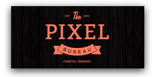
Perhaps the most important part of a website layout is the area at the top of the page where the logo or title and tagline are placed. On the whole, Internet viewers make snap decisions when browsing web pages so it is imperative to grab their attention immediately with well-designed headline text. This is an appropriate place for the designer to use creative license and less-common fonts to design something eye-catching and imaginative. Display fonts belong here, in moderation of course.
2. Paragraph Header Fonts
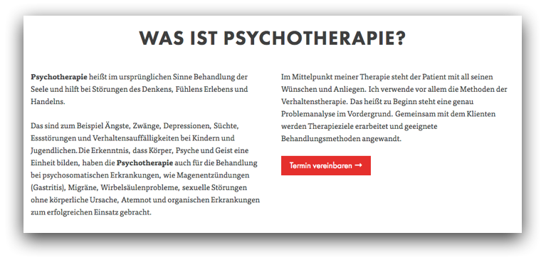
The next font to choose when designing a webpage is the header font. A header identifies the content contained in the subsequent paragraph, so it is important to choose an appropriate typeface that will set the tone for the material on the page. It should stand out from the rest of the body copy in the layout, but should not outdo the logo and tagline area at the top of the page. Most importantly, the eye should be able to easily jump to and rest on headers as the page is scanned.
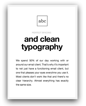
Display or body fonts can be used here, depending on the situation. A good rule of thumb is to choose a font that is less decorative than the headline area of the page, but more ornamental than the font that you will be choosing for the paragraph text. Another approach is to use a simple sans-serif font for headers in combination with serifed paragraph text.
3. Body Copy Fonts
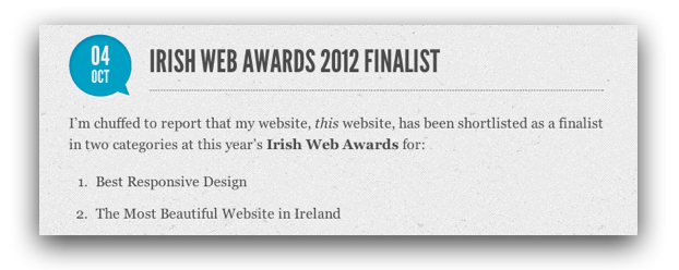
Picking a typeface for paragraph text, or body copy as it is sometimes called, is another important decision. If the wrong choice is made, the viewer may not fully absorb the information that you are trying to convey, or she may quickly become tired and lose interest in the content. The most important quality of this area of the page is readability. Text should flow effortlessly from line to line and should be easy to read.
Mixing and Matching
There are several guidelines that can be helpful when learning to pair fonts effectively. Individuals often wonder how many fonts can be used on one page; there is no hard limit, but just be aware that the more fonts that are introduced, the more difficult it is to create a unified, harmonious overall design. If you stick to two typefaces, your task will be more straightforward. If you decide to use a larger number – say, six – you're in a danger zone; you will need to be especially cognizant of the following tips and rules, and you will be running the risk of drowning out the content itself with the presentation.
The Keys: Contrasting Forms, Dedicated Sizes, Related Colors
When examining typeface form, it is important to know that opposites attract. A serif font paired with a sans-serif font often creates a pleasing combination. A thick, bold header juxtaposed with thinner text will create an equally enjoyable look. Or an elaborate script might contrast nicely with a simple sans serif. However, size holds to a different set of rules than form. When mixing typefaces, it is advisable to assign each face to a specific range of sizes. For example, if you are using Edwardian Script and Helvetica, limit the use of Edwardian Script to larger paragraph headers and use Helvetica only for body copy. If you are using multiple fonts within one header or section, it is best to keep the point size of each font similar, so as not to be jarring to the eye.
Color is another important consideration when pairing fonts. The colors should relate to one another in some concrete way; limiting the color scheme to a range of similar colors creates a sense of harmony. But use your own discretion; one of the most important parts of pairing fonts is using your own creative judgment. If you have followed all of these guidelines but feel that your design is lacking something, follow your gut!
Examples
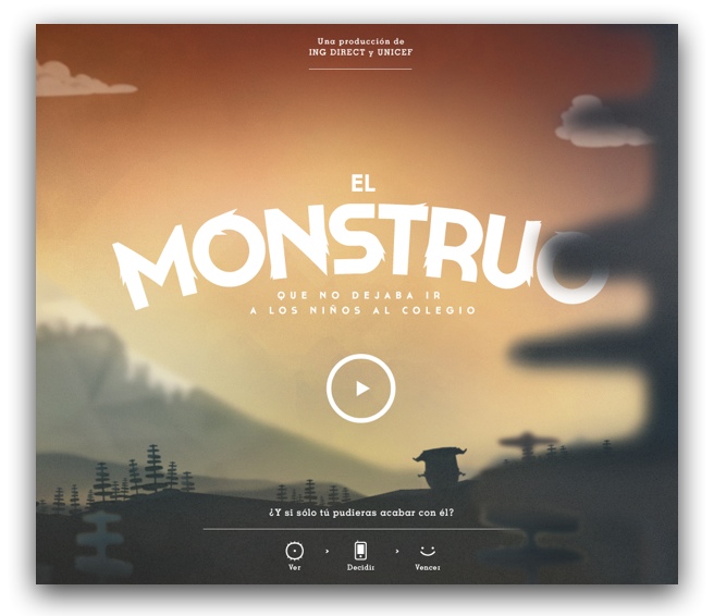
There are many great examples of effective font pairing online. ElMonstruo.org, a website created by ING Direct and Unicef, is a great example. The thick, decorative font used for the header, “El Monstruo,” pairs nicely with the thinner, smaller sans-serif font used for the subhead below. A tiny slab serif also hides underneath, relating to the subhead in both proportion and style; this same font is used for body text elsewhere in the site. All the text on the homepage is white, further adding to its cohesive feel; black and orange text on content pages provides contrast.
Another fantastic example is the Brooklyn Soap Company. Here the designer has used a decorative script font for the words “New York City,” and a thick, simple sans-serif for the company name. This same font is repeatedly used in dark gray throughout the rest of the page’s headings. As the viewer scrolls down, a gentle serif is introduced, being used for the body copy only. Color again plays a roll of unification; black, gray and red are the only text colors on the page, giving it a monochromatic and cohesive feel.
All of the earlier examples of different text types are linked to their corresponding sites as well.
Tools
One of the best ways to learn about effective font combinations is to browse well-designed sites such as those above. There are also sites such as I Font You that are dedicated to providing examples of good pairings. Remember, though, that font pairing is ultimately an art and depends on your preferences and design instincts.
If you're working with Google Web Fonts, you will likely find the Pairings section on each font page helpful:
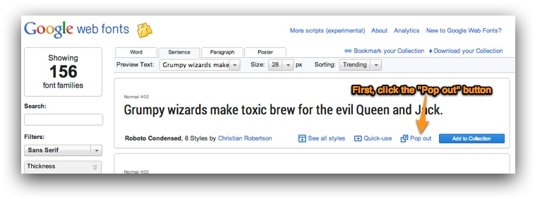
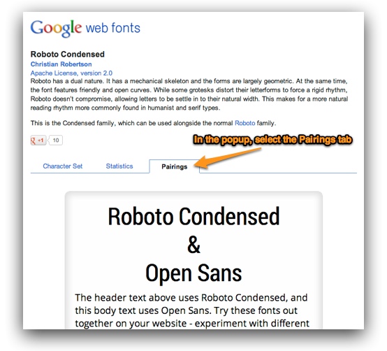
This tool shows common font combinations that use the current font, giving you a jumpstart as you choose complementary typefaces.
Conclusion
Mixing and matching fonts can be challenging, but using these tips can help to alleviate the stress associated with pairing them effectively. Form, size and color all play a part in designing a successful layout that incorporates several typefaces. Choose your fonts wisely and with intention, in a way that guides your viewer’s eye through the page. And when in doubt, don’t forget to trust your own instincts.
Do you have any favorite font pairings or want to share a great example of creative typography? Please post in the comments below!


