 Download Help PDF (29MB) | Search:
The Properties Panel contains options for modification of all common settings on each element. It allows you to position, size, configure, and customize each element to fit with your design and behavior goals. The panel is accessed on the right side of the Layout / Presentation section, to the right of the Design Area:
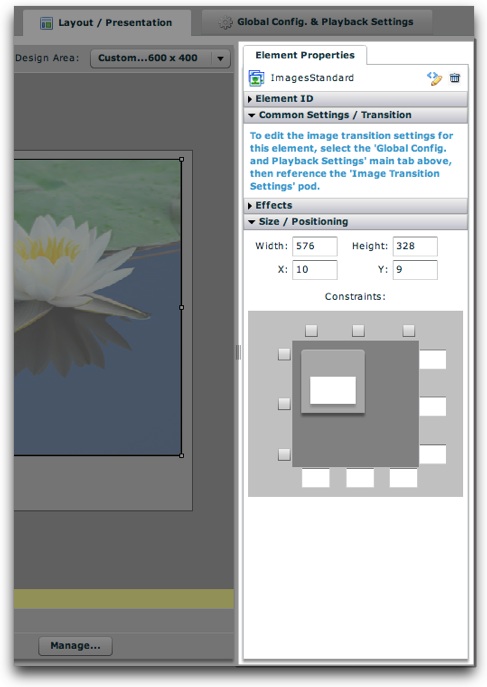
The panel varies for every element based on the available settings. The options for some elements require more width; in these cases, you'll need to expand the width of the panel. To resize the panel, use the draggable resizer on the right edge of the box:

You can shrink it back when finished if you want more room for the design area.
When an element is selected, some common items always appear at the top of the panel:
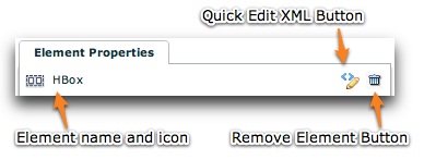
On the left, the element name and icon are displayed. Clicking on the element name will open the element's documentation (in the Available Elements section). The second button on the right is the Remove Element button; clicking it will remove the element from your layout. You can undo a remove by using the Undo button at the top of the Design Area. The first button on the right is the Quick Edit Element XML button. Clicking it will launch the Quick Tag Editor dialog:
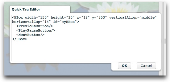
Here, you can make changes directly to the element's XML, including any of its child nodes. Be careful editing the code!
The properties for each element are grouped into expandable/collasible sections, or "pods," within the panel. By default, only some pods will be expanded. To expand a pod, click its title. For example, here an HBox element is shown:
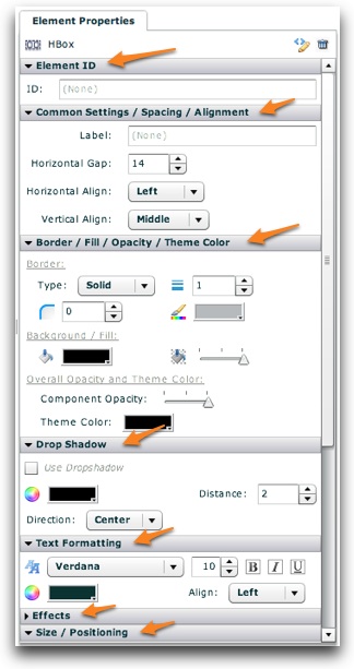
The HBox has so many properties that they don't even all show on this screenshot. Its spacing and alignment, it border and background and dropshadow, and its text styles can be set (the text styles apply to all of its child elements). Every element has a different set of options, but there are some common settings which all (or almost all) elements have. These are listed below:
First, there is the Element ID value. This optional value specifies a unique ID which can be used to reference the component elsewhere to set styles or properties dynamically at runtime (e.g. via a button click):

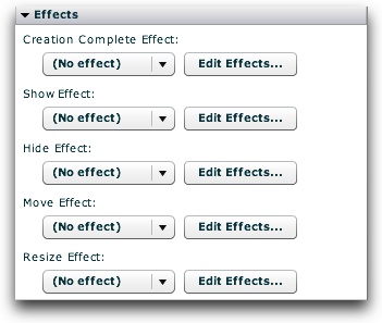
Next, there is the Effects section. Effects can be applied to various events in an element's lifecycle. To learn more about using UI Effects, see the Using UI Effects topic.
Finally, there is the Size / Position section. This is where you can precisely position and size the element. To learn more about element positioning and sizing, see the Element Positioning and Sizing topic.
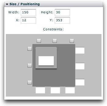
Or (depending on the element's container type):
