 Download Help PDF (29MB) | Search:
Once you've created the various layout views, you're ready to add content to each of them. As mentioned in the previous topic on views, you'll click on a view's box in the View Management Bar to select it for editing.
Each view contains various components. These components, also known as "elements", are small building blocks which are used to construct the user interface. For example, here are some of the available elements:
In addition to the main elements which have a direct visual representation, there are also several non-visual layout container elements. These elements allow you to create fluid layouts which are easily resized and easier to manage and work with at design-time.
These layout elements are designed to hold child elements and lay them out in a specific way. The most common layout container elements are:
When you add new elements to a layout, they are automatically positioned on top of other elements. To re-order elements visually, right-click on an item in the Design Area and select either Move Item Up (above other elements) or Move Item Down (below other elements). For more information, see the Design Area and Components Panel topic.
The depth of elements is controlled by their relative order in the Layout XML code. Elements listed later will appear on top of elements listed earlier in the XML. If you're comfortable with basic code editing, you can re-order elements by switching to code view and moving the highlighted node.
There are a number of different methods which can be used to position and size elements. These methods are covered in detail in the Element Positioning and Sizing topic.
All elements have numerous styling options which can be used to customize their appearance. This is covered in the upcoming Element Styling topic.
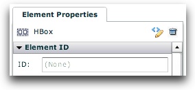
If you wish to reference a certain element elsewhere in your slideshow via code, you will need to specify a unique ID value for that element. In the wizard, this is done through the Element ID section of the Properties Panel:

More detailed information about the XML element structure and available attribute formats can be found in the reference for the com.dwuser.ss4.ui.LayoutManager class in the API Reference. Additionally, each component is represented by a class of the same name. Each of these classes is fully documented in the API Reference; each page lists all available properties and style settings for that element, as well as displaying an XML code example (helpful if editing the Layout XML directly).
Handling Element Events and Slideshow Events on Elements
Some elements dispatch events. The available events for each element are listed in the element's class documentation. Additionally, the main slideshow dispatches many events which notify of the slideshow status (see the FlashSlideshow class for a full listing). You can define handlers for these events by specifying an attribute on the element of this format: event_eventNameHere="...handler code..." (where the handler code is Actionscript). To add a handler which is triggered when a global slideshow event is dispatched, use the following format: ssevent_eventNameHere="...handler code..." (where the handler code is Actionscript). The following example shows a button whose label changes when it is clicked, and a label which displays a notification when the global SlideshowEvent.LAYOUT_MANAGERREADY event is dispatched:
<Button label="Not clicked yet..." event_click="event.target.label = 'Has been clicked!';" />
<Label id="sampleLabel" text="Waiting for the event to happen..." ssevent_layoutManagerReady="sampleLabel.text += 'DONE!';" />