 Download Help PDF (29MB) | Search:
There are many options available to customize the appearance and behavior of the layout elements which make up a slideshow's user interface. These options are collectively known as styles.
Four different types of styles exist; each are covered in more detail below.
These styles are applied directly to a single element instance using the Properties Panel in the wizard (or by adding attributes directly to the element's XML node if editing the XML directly). Because they are instance-specific, they have no effect on any other instances of the element.
Important Note: The common style options for each element can be accessed directly in the wizard by using the Properties Panel. To view a comprehensive list of all styles and properties available for each element, view the class reference for the element in question in the API Reference.
Important Note: Properties are always instance-specific. They are not inherited, nor can they be defined globally. Only style properties (as listed under the Styles section in the API reference) can be inherited or defined globally.
Some style properties automatically are passed from a parent element to all child instances. The most common examples are:
If you wish to customize a non-inheriting style on all instances of a certain element without repeatedly setting a value, you can use global element styles.
These styles are defined in the <styles> section of the XML configuration file, using a selector (node name) equal to the element's name. For example, <styles> ... <ImagesStandard someProperty="someValue" /> ... </styles> would set the someProperty style/property to someValue on all ImagesStandard element instances, unless it were overridden on a specific instance with an instance-specific style value.
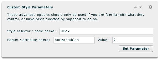
To apply global element styles in the wizard, you will use the 'Custom Style Parameters' pod in the main Global Configuration and Playback Settings tab:

First, you enter the Style Selector. Then, you enter the parameter and its value. In the example shown above, a default value of 2 is being established for the horizontalGap property on all HBox elements.
As mentioned above, to view a comprehensive list of all styles available for each element, view the class reference for the element in question in the API Reference.
The preceding section addressed global styles for elements which visibly are defined in your slideshow layout. However, there are also other styles which have no direct visual representation. This encompasses both special element states as well as non-visual settings which are set by using style values.
One of the most common examples is the Thumbnails element. For each Thumb instance in the Thumbnails element, there are three different states:
Even though none of these states visibly exist in your layout, you still want to be able to apply styles to them in order to customize each state. For example, you might want to add a border to a hovered-over thumbnail, or gray out visited thumbnails. (For this example, the mentioned settings can be visually edited through the 'Common / Layout & Appearance' section of the Properties Panel when a Thumbnails instance is selected.)
As another common use, there are many generic settings which are specified through special global style selectors. For instance, the IndividualSlide and IndividualSlideImage selectors provide control over the appearance of each of the slides in a slideshow. The ImageManager selector provides control over many generic settings such as the loading method used. (Many of the styles/settings mentioned here can be edited visually in the wizard, through the Slide Appearance and Global Configuration & Playback Settings main tabs. Details on all available settings, along with XML examples, can be found on the various class files in the API Reference.)
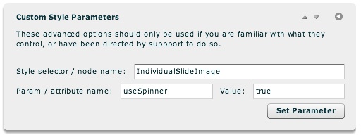
To make customizations such as this for non-visual styles and settings, you use a global style selector, in the same manner detailed in the preceding 'Global Element Styles with a Direct Visual Representation' section. As mentioned in that section, to apply global styles / settings in the wizard, you will use the 'Custom Style Parameters' pod in the main Global Configuration and Playback Settings tab:

You enter a selector, parameter name, and value. In this example, the non-visual IndividualSlideImage selector is used. The useSpinner property is being enabled.
As mentioned above, details on all available selectors and their settings, along with XML examples, can be found in the class files in the API Reference.