 Download Help PDF (29MB) | Search:
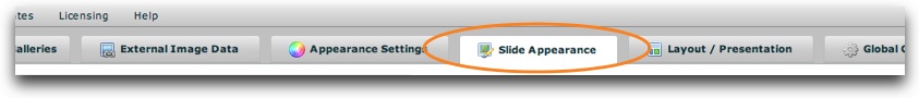
The main Slide Appearance section is accessed by selecting the tab at the top of the wizard window:
The Slide Appearance section is where you will configure many settings which control the appearance of each of the photos / slides in the slideshow. The section appears as follows:
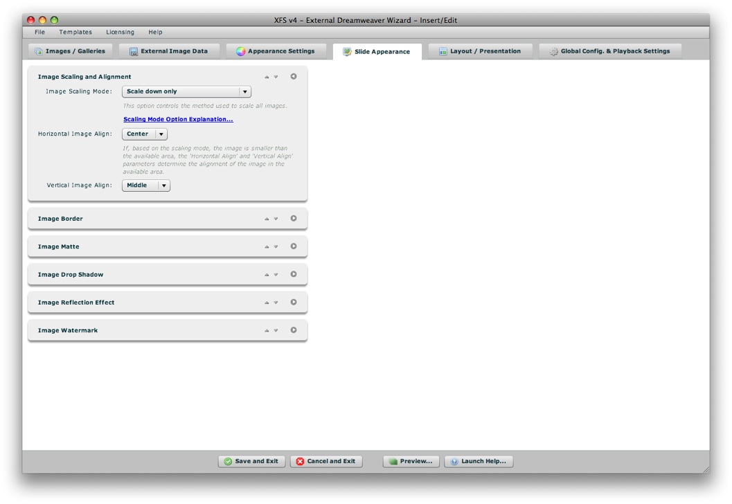
The Slide Appearance panel is made up of a number of collapsible pods. You can expand the pods which are most relevant to you, and re-order them as desired. The order and expanded/collapsed state of the pods is automatically saved, and the last view is restored each time you re-launch the wizard. This is designed to streamline the development process, instantly placing the most relevant and commonly used settings at your fingertips.
Each pod has several control buttons at the top right:
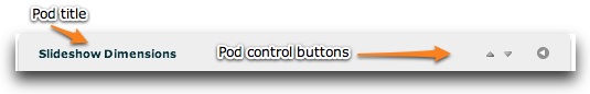
The first button allows you to move the pod up one space:
The second button allows you to move the pod down one space:
The third and final button allows you to expand or collapse the pod:

Tip: You can also expand or collapse a pod by clicking on its title.
When collapsed, a pod will appear like this:

The following sections of this topic detail each pod and the options each controls.
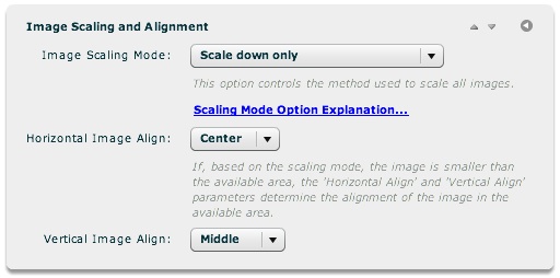
The settings in this pod control how the photos on each slide are scaled and aligned. If, based on the scaling mode, the image is smaller than the available area, the Horizontal Image Align and Vertical Image Align settings determine the alignment of the image within the available area.
| Property | Description |
|---|---|
| Image Scaling Mode | Specifies how the slide images are scaled. The available scaling modes are:
|
| Horizontal Image Align | If, based on the scaling mode, the image width is smaller than the available width, this determines the horizontal alignment of the image within the available area. |
| Vertical Image Align | If, based on the scaling mode, the image height is smaller than the available height, this determines the vertical alignment of the image within the available area. |
Note: See the API Reference for each referenced class for more information.
| Property | XML Destination |
|---|---|
| Image Scaling Mode | IndividualSlide.@scaleMode |
| Horizontal Image Align | IndividualSlide.@horizontalAlign |
| Vertical Image Align | IndividualSlide.@verticalAlign |
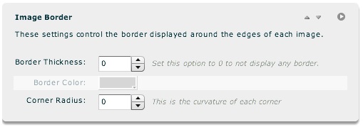
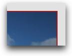
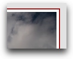
The settings in this pod control the border displayed around the edges of each image. Here is an example of an image with a 2px red border:
Once you set the Border Thickness to a value of greater than 0 (which enables the border), the Border Color option becomes enabled:
Option details:
| Property | Description |
|---|---|
| Border Thickness | The width, in pixels, of the border around the image on each slide. Using a value of 0 will disable the border. |
| Border Color | If a border has been configured to show (Border Thickness > 0), specifies the color of that border. |
| Corner Radius | Specifies the radius of curvature (in pixels) of the border if enabled. |
Note: See the API Reference for each referenced class for more information.
| Property | XML Destination |
|---|---|
| Border Thickness | IndividualSlideImage.@borderThickness |
| Border Color | IndividualSlideImage.@borderColor |
| Corner Radius | IndividualSlideImage.@cornerRadius |
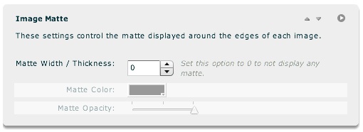
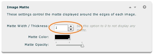
The settings in this pod control the matte displayed around the edges of each image. Here is an example of an image with a 5px white matte and 2px red border:
Mattes are essentially an "inner border" if used in conjunction with a regual border (as defined in the Image Border pod). If you enable a matte by setting the Matte Width / Thickness to a value of 1 or greater, the other two option will become enabled:
Option details:
| Property | Description |
|---|---|
| Matte Width / Thickness | The width, in pixels, of the matte around the image on each slide. Using a value of 0 will disable the matte. |
| Matte Color | If a matte has been configured to show (Matte Width / Thickness > 0), specifies the color of that matte. |
| Matte Opacity | Specifies the opacity/transparency of the matte if enabled. |
Note: See the API Reference for each referenced class for more information.
| Property | XML Destination |
|---|---|
| Matte Width / Thickness | IndividualSlideImage.@paddingLeft, IndividualSlideImage.@paddingRight, IndividualSlideImage.@paddingTop, IndividualSlideImage.@paddingBottom |
| Matte Color | IndividualSlideImage.@backgroundColor |
| Matte Opacity | IndividualSlideImage.@backgroundAlpha |
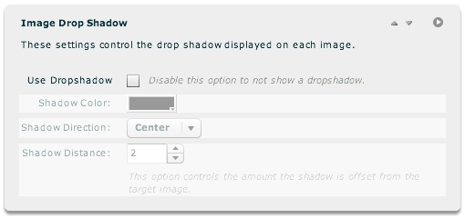
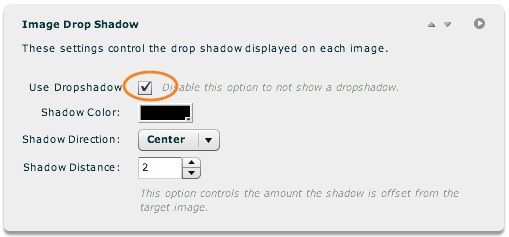
The settings in this pod allow you to add a drop-shadow to each slide. Once you enable the 'Use Dropshadow' option, all of the other options become enabled. Here is an example of a slide with a drop shadow:

Option details:
| Property | Description |
|---|---|
| Use Dropshadow | Specifies if a dropshadow should be shown on each slide |
| Shadow Color | If a drop-shadow has been enabled, specifies the color of the shadow |
| Shadow Direction | If a drop-shadow has been enabled, specifies the direction of the shadow. This value can effectively be reversed by using a negative Shadow Distance. Supported values are:
|
| Shadow Distance | If a drop-shadow has been enabled, specifies the number of pixels the shadow is offset from the slide. Negative values can be used to reverse the shadow direction. |
Note: See the API Reference for each referenced class for more information.
| Property | XML Destination |
|---|---|
| Use Dropshadow | IndividualSlideImage.@dropShadowEnabled |
| Shadow Color | IndividualSlideImage.@dropShadowColor |
| Shadow Direction | IndividualSlideImage.@shadowDirection |
| Shadow Distance | IndividualSlideImage.@shadowDistance |
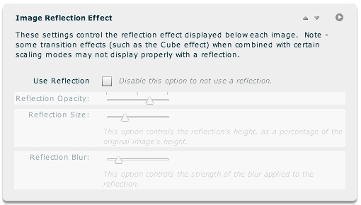
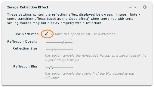
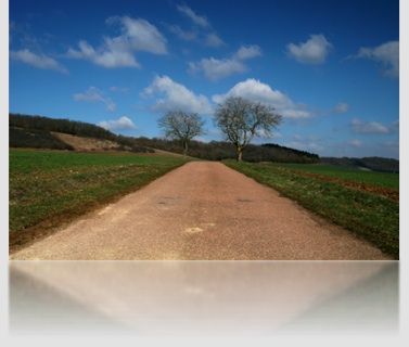
The settings in this pod allow you to add a reflection effect to each slide. Once you enable the 'Use Reflection' option, all of the other options become enabled. Here is an example of a slide with a reflection effect applied:
Option details:
| Property | Description |
|---|---|
| Use Reflection | Specifies if a reflection should be shown on each slide. |
| Reflection Opacity | If a reflection is enabled, specifies the opacity/transparency of the reflection. A lower opacity will result in a more subtle effect. |
| Reflection Size | If a reflection is enabled, controls the height of the reflection as a percentage of the original image's height. |
| Reflection Blur | If a reflection is enabled, controls the strength of the blur applied to the reflection. Set to 0 to disable blurring. |
Note: See the API Reference for each referenced class for more information.
| Property | XML Destination |
|---|---|
| Use Reflection | IndividualSlide.@useReflection |
| Reflection Opacity | IndividualSlide.@reflectionAlpha |
| Reflection Size | IndividualSlide.@reflectionSize |
| Reflection Blur | IndividualSlide.@reflectionBlur |
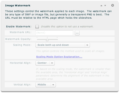
The settings in this pod allow you to add a watermark to each slide. This is another image (JPEG, PNG, SWF, or GIF) which overlays every main slide, displaying ownership information etc. Once you enable the 'Enable Watermark' option, all of the other options become enabled:
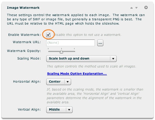
Option details:
| Property | Description |
|---|---|
| Enable Watermark | Specifies if a watermark should be used. If you enable this option, you must then specify a Watermark URL. |
| Watermark URL | If a watermark is enabled, specifies the URL of the watermark overlay image. This file can be a JPEG, PNG, SWF, or GIF. The path must be relative to the HTML page holding the slideshow; such a path will be generated automatically if you use the browse button ('...') to the right of the field. |
| Watermark Opacity | If a watermark is enabled, specifies the opacity/transparency of the overlaid image. A lower opacity will result in a more subtle watermark. |
| Scaling Mode | If a watermark is enabled, specifies the scaling mode used for the overlay image. To learn more about the available scaling modes, see the "Image Scaling Mode" parameter in the The Image Scaling and Alignment Pod section above. |
| Horizontal Align | Only applicable if a watermark is enabled. If, based on the watermark scaling mode, the watermark is smaller than the available area, this setting controls the horizontal alignment of the overlaid image within the available area. |
| Vertical Align | Only applicable if a watermark is enabled. If, based on the watermark scaling mode, the watermark is smaller than the available area, this setting controls the vertical alignment of the overlaid image within the available area. |
Note: See the API Reference for each referenced class for more information.
| Property | XML Destination |
|---|---|
| Enable Watermark | IndividualSlide.@useWatermark |
| Watermark URL | WatermarkImage.@watermarkURL |
| Watermark Opacity | WatermarkImage.@watermarkAlpha |
| Scaling Mode | WatermarkImage.@scaleMode |
| Horizontal Align | WatermarkImage.@horizontalAlign |
| Vertical Align | WatermarkImage.@verticalAlign |