 Download Help PDF (29MB) | Search:
The Main Slideshow Elements are a class of essential slideshow components which are used when building layouts. The common thread is that this class of elements provides a means to organize and navigate the gallery and image data you have added to your slideshow. For example -- gallery selection elements (needed if more than one gallery exists), caption and dynamic text (for displaying the caption, title, etc. associated with a slide), and standard navigation modules such as Thumbnails.
Elements in this section:
Advanced Users / Developers: For more detailed developer-oriented information about every element in this section, be sure to see the API reference for each element's corresponding class.
Tip: All of the elements within this section can be placed in a HoverCanvas element, which makes them only visible when the user actively moves the mouse over the slideshow. See the HoverCanvas layout container for more.
This special starter element is a horizontal control bar which contains a NumberBar; because it is inside a HoverCanvas, it is only visible when the user moves their mouse. It is designed to go at the bottom of the slideshow by default, but may be moved anywhere. The default buttons can be customized as needed. Buttons can also be added or removed.
The following image shows one of these control bars (with default configuration) in use within a slideshow:

Note: All the individual elements which comprise a starter element can be individually edited after the starter element has been added.
Equivalement Class File
This is a compound starter element made up of other elements; it has no individual associated class file.
The Layout XML for the starter element is as follows:
<HoverCanvas left="0" right="0" bottom="0">
<HBox left="0" right="0" bottom="0" paddingLeft="10" paddingRight="10" paddingTop="3" paddingBottom="3" horizontalGap="10" backgroundColor="#000000" backgroundAlpha="0.8" verticalAlign="middle">
<PlayPauseButton/>
<CaptionToggleButton/>
<PreviousButton/>
<NumberBar width="100%"/>
<NextButton/>
<FullScreenButton/>
</HBox>
</HoverCanvas>
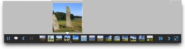
This special starter element is a horizontal control bar which displays a row of thumbnails; because it is inside a HoverCanvas, it is only visible when the user moves their mouse. It is designed to go at the bottom of the slideshow by default, but may be moved anywhere. The default buttons can be customized as needed. Buttons can also be added or removed.
The following image shows one of these control bars (with default configuration) in use within a slideshow:
Note: All the individual elements which comprise a starter element can be individually edited after the starter element has been added.
Equivalement Class File
This is a compound starter element made up of other elements; it has no individual associated class file.
The Layout XML for the starter element is as follows:
<HoverCanvas left="0" right="0" bottom="0">
<HBox left="0" right="0" bottom="0" paddingLeft="10" paddingRight="10" paddingTop="3" paddingBottom="3" horizontalGap="10" backgroundColor="#000000" backgroundAlpha="0.8" verticalAlign="middle">
<PlayPauseButton/>
<CaptionToggleButton/>
<PreviousButton/>
<Thumbnails width="100%" height="24"/>
<NextButton/>
<FullScreenButton/>
</HBox>
</HoverCanvas>
This special starter element is a horizontal control bar which contains a NumberBar; it is always visible, regardless of user interaction (unlike its hover-only counterpart above). It is designed to go at the bottom of the slideshow by default, but may be moved anywhere. The default buttons can be customized as needed. Buttons can also be added or removed.
The following image shows one of these control bars (with default configuration) in use within a slideshow:
Note: All the individual elements which comprise a starter element can be individually edited after the starter element has been added.
Equivalement Class File
This is a compound starter element made up of other elements; it has no individual associated class file.
The Layout XML for the starter element is as follows:
<HBox left="0" right="0" bottom="0" paddingLeft="10" paddingRight="10" paddingTop="3" paddingBottom="3" horizontalGap="10" backgroundColor="#000000" backgroundAlpha="0.8" verticalAlign="middle">
<PlayPauseButton/>
<CaptionToggleButton/>
<PreviousButton/>
<NumberBar width="100%"/>
<NextButton/>
<FullScreenButton/>
</HBox>
This special starter element is a horizontal control bar which displays a row of thumbnails; it is always visible, regardless of user interaction (unlike its hover-only counterpart above). It is designed to go at the bottom of the slideshow by default, but may be moved anywhere. The default buttons can be customized as needed. Buttons can also be added or removed.
The following image shows one of these control bars (with default configuration) in use within a slideshow:
Note: All the individual elements which comprise a starter element can be individually edited after the starter element has been added.
Equivalement Class File
This is a compound starter element made up of other elements; it has no individual associated class file.
The Layout XML for the starter element is as follows:
<HBox left="0" right="0" bottom="0" paddingLeft="10" paddingRight="10" paddingTop="3" paddingBottom="3" horizontalGap="10" backgroundColor="#000000" backgroundAlpha="0.8" verticalAlign="middle">
<PlayPauseButton/>
<CaptionToggleButton/>
<PreviousButton/>
<Thumbnails width="100%" height="24"/>
<NextButton/>
<FullScreenButton/>
</HBox>
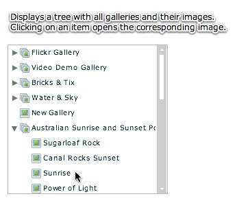
The ImageTree element is useful when building portfolio-style presentations. It displays a hierachical tree of all galleries and their constituent images. When an item is selected in the tree, the corresponding slide is displayed.
The following image illustrates an ImageTree in use within a slideshow:
Important Usage Notes
It is often better to use the GalleryBar or GallerySelector elements to allow switching between galleries; the ImageTree is only for uniquely specialized instances.
Noteworthy Parameters
The Common Settings section of the Properties Panel contains several noteworthy parameters; they are described in the table below:
| Parameter name in Properties Panel | XML Property Name | Notes |
|---|---|---|
| Label Field | labelField | Specifies which gallery and image attribute (from the XML) should be displayed in the tree to describe each item. Usually the default value is best; it displays the gallery and image titles. |
| Enable Gallery Jump | enableGalleryJump | Specifies if the user can select a gallery folder in the tree to open that gallery. By default, the user must select an image item for anything to happen. |
Equivalement Class File
For detailed reference on this element, see the com.dwuser.ss4.ui.ImageTree class in the API Reference.
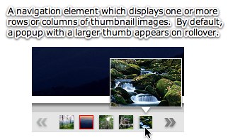
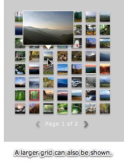
The Thumbnails element is one of the most important elements. It displays a grid of all thumbnails in the current gallery. The element can be sized and oriented horizontally or vertically. By default, a tooltip with a larger thumbnail or more information is displayed when each thumbnail is hovered over.
The following images illustrate Thumbnails elements in use within a slideshow:
Important Usage Notes
Note the many paging control options shown below -- they provide a wide range of control over the paging / scrolling.
If you want a background, border, or drop shadow displayed behind the thumbnail grid, see the Border / Fill and Drop Shadow sections of the Properties Panel after selecting the element.
Noteworthy Parameters
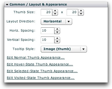
The Common / Layout & Appearance section of the Properties Panel contains several noteworthy parameters; they are described in the table below:
| Parameter name in Properties Panel | XML Property Name | Notes |
|---|---|---|
| Thumb Size | tileWidth | Specifies (in pixels) the width of each thumbnail |
| tileHeight | Specifies (in pixels) the height of each thumbnail | |
| Horizontal Spacing | horizontalGap | Specifies (in pixels) the horizontal spacing between each thumbnail |
| Vertical Spacing | verticalGap | Specifies (in pixels) the vertical spacing between each thumbnail |
| Tooltip Style | tooltipStyle | Specifies the type of popup tooltip shown when each thumb is hovered over. Possible values include:
|
| Edit Normal Thumb Appearance... | Controls the <Thumb> style selector settings | Opens a popup dialog where you can manipulate the appearance of thumbnails in their standard 'up' state, including border / matte, opacity, color manipulations, and much more. |
| Edit Hover-State Thumb Appearance... | Controls the <ThumbHover> style selector settings | Opens a popup dialog where you can manipulate the appearance of thumbnails when they are hovered-over, including border / matte, opacity, color manipulations, and much more. |
| Edit Selected-State Thumb Appearance... | Controls the <ThumbSelected> style selector settings | Opens a popup dialog where you can manipulate the appearance of thumbnails in their selected state (when they represent the currently selected slide), including border / matte, opacity, color manipulations, and much more. These settings override the Normal and Visited state, but are overridden by the Hover state. |
| Edit Visited-State Thumb Appearance... | Controls the <ThumbVisited> style selector settings | Opens a popup dialog where you can manipulate the appearance of thumbnails in their visited state (when they represent slides which have been already viewed), including border / matte, opacity, color manipulations, and much more. These settings override the Normal state, but are overridden by the Hover and Visited states. |
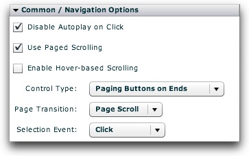
The Common / Navigation Options section of the Properties Panel also contains many important settings; they are described in the table below:

| Parameter name in Properties Panel | XML Property Name | Notes |
|---|---|---|
| Use Paged Scrolling | usePagedScrolling | Specifies if scrolling should be page-based or continuous. |
| Enable Hover-based Scrolling | hoverScrollEnabled | Specifies if hover-based scrolling is enabled (only works if 'Use Paged Scrolling' is disabled). If enabled and 'Use Paged Scrolling' is disabled, the user can scroll simply by mousing over the element and moving the mouse towards one end or the other. |
| Control Type | pagingStyle | In the default state (when no custom PagingControls descriptor has been specified), specifies the type and location of paging controls shown. |
| Page Transition | transitionType | Specifies the type of transition effect used between each page when page-based scrolling is enabled. |
| Selection Event | selectionEvent | Specifies whether a tile will become selected when the user clicks it, or when they simply mouse over it. Usually best to leave the default value of Click. |
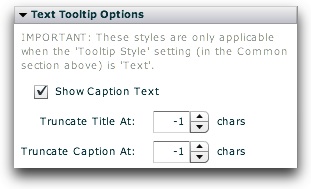
The Text Tooltip Options section of the Properties Panel contains settings which control the appearance of the tooltip if the Text tooltip option was chosen for the 'Tooltip Style' setting. If the Image or None setting is used, the settings in this panel are not applicable. The table below describes the options:

| Parameter name in Properties Panel | XML Property Name | Notes |
|---|---|---|
| Show Caption Text | tooltipShowCaption | Specifies if the caption text should be shown along with the title text in the tooltip. By default, both are shown; if this setting is disabled, only the title text will be shown. |
| Truncate Title At | tooltipTruncateTitleAt | Specifies the maximum length of the title text displayed in the tooltip. If the length exceeds the specified value, the title text will be truncated with an ellipsis (...). The default value, -1, means that truncation should never occur, regardless of length. |
| Truncate Caption At | tooltipTruncateCaptionAt | Specifies the maximum length of the caption text displayed in the tooltip. If the length exceeds the specified value, the caption text will be truncated with an ellipsis (...). The default value, -1, means that truncation should never occur, regardless of length. |
Equivalement Class File
For detailed reference on this element, see the com.dwuser.ss4.ui.Thumbnails class in the API Reference.
For the thumbnail classes, see com.dwuser.ss4.ui.Thumb and com.dwuser.ss4.pseudoStyleClasses.ThumbHover and com.dwuser.ss4.pseudoStyleClasses.ThumbSelected and com.dwuser.ss4.pseudoStyleClasses.ThumbVisited .
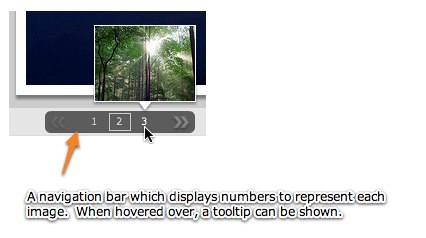
The NumberBar element is analogous to the JumpBar in version 3. It displays a grid (or single row/column) of numbers with one to represent each slide in the current gallery. The element can be sized and oriented horizontally or vertically. By default, a tooltip with a thumbnail or more information is displayed when each number is hovered over.
The following image illustrates a NumberBar element in use within a slideshow:
Important Usage Notes
Note the many paging control options shown below -- they provide a wide range of control over the paging / scrolling.
If you want a background, border, or drop shadow displayed behind the NumberBar, see the Border / Fill and Drop Shadow sections of the Properties Panel after selecting the element.
Noteworthy Parameters
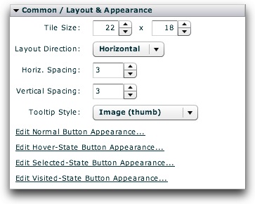
The Common / Layout & Appearance section of the Properties Panel contains several noteworthy parameters; they are described in the table below:
| Parameter name in Properties Panel | XML Property Name | Notes |
|---|---|---|
| Tile Size | tileWidth | Specifies (in pixels) the width of each tile. |
| tileHeight | Specifies (in pixels) the height of each tile. | |
| Horizontal Spacing | horizontalGap | Specifies (in pixels) the horizontal spacing between each tile. |
| Vertical Spacing | verticalGap | Specifies (in pixels) the vertical spacing between each tile. |
| Tooltip Style | tooltipStyle | Specifies the type of popup tooltip shown when each number is hovered over. Possible values include:
|
| Edit Normal Button Appearance... | Controls the <NumberBarTile> style selector settings | Opens a popup dialog where you can manipulate the appearance of the tiles in their standard 'up' state, including border / matte, opacity, color manipulations, and much more. |
| Edit Hover-State Button Appearance... | Controls the <NumberBarTileHover> style selector settings | Opens a popup dialog where you can manipulate the appearance of the tiles when they are hovered-over, including border / matte, opacity, color manipulations, and much more. |
| Edit Selected-State Button Appearance... | Controls the <NumberBarTileSelected> style selector settings | Opens a popup dialog where you can manipulate the appearance of the tiles in their selected state (when they represent the currently selected slide), including border / matte, opacity, color manipulations, and much more. These settings override the Normal and Visited state, but are overridden by the Hover state. |
| Edit Visited-State Button Appearance... | Controls the <NumberBarTileVisited> style selector settings | Opens a popup dialog where you can manipulate the appearance of the tiles in their visited state (when they represent slides which have been already viewed), including border / matte, opacity, color manipulations, and much more. These settings override the Normal state, but are overridden by the Hover and Visited states. |
The Common / Navigation Options section of the Properties Panel also contains many important settings; they are described in the table below:
| Parameter name in Properties Panel | XML Property Name | Notes |
|---|---|---|
| Use Paged Scrolling | usePagedScrolling | Specifies if scrolling should be page-based or continuous. |
| Enable Hover-based Scrolling | hoverScrollEnabled | Specifies if hover-based scrolling is enabled (only works if 'Use Paged Scrolling' is disabled). If enabled and 'Use Paged Scrolling' is disabled, the user can scroll simply by mousing over the element and moving the mouse towards one end or the other. |
| Control Type | pagingStyle | In the default state (when no custom PagingControls descriptor has been specified), specifies the type and location of paging controls shown. |
| Page Transition | transitionType | Specifies the type of transition effect used between each page when page-based scrolling is enabled. |
| Selection Event | selectionEvent | Specifies whether a tile will become selected when the user clicks it, or when they simply mouse over it. Usually best to leave the default value of Click. |
The Text Tooltip Options section of the Properties Panel contains settings which control the appearance of the tooltip if the Text tooltip option was chosen for the 'Tooltip Style' setting. If the Image or None setting is used, the settings in this panel are not applicable. The table below describes the options:
| Parameter name in Properties Panel | XML Property Name | Notes |
|---|---|---|
| Show Caption Text | tooltipShowCaption | Specifies if the caption text should be shown along with the title text in the tooltip. By default, both are shown; if this setting is disabled, only the title text will be shown. |
| Truncate Title At | tooltipTruncateTitleAt | Specifies the maximum length of the title text displayed in the tooltip. If the length exceeds the specified value, the title text will be truncated with an ellipsis (...). The default value, -1, means that truncation should never occur, regardless of length. |
| Truncate Caption At | tooltipTruncateCaptionAt | Specifies the maximum length of the caption text displayed in the tooltip. If the length exceeds the specified value, the caption text will be truncated with an ellipsis (...). The default value, -1, means that truncation should never occur, regardless of length. |
Equivalement Class File
For detailed reference on this element, see the com.dwuser.ss4.ui.NumberBar class in the API Reference.
For the tile (number button) classes, see com.dwuser.ss4.ui.NumberBarTile and com.dwuser.ss4.pseudoStyleClasses.NumberBarTileHover and com.dwuser.ss4.pseudoStyleClasses.NumberBarTileSelected and com.dwuser.ss4.pseudoStyleClasses.NumberBarTileVisited .
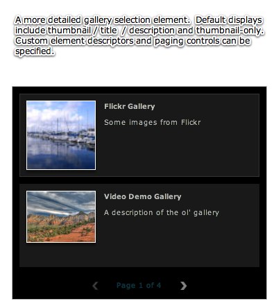
The GallerySelector element provides a grid of all image galleries in the slideshow (with automatic pagination if needed). Two default display types are supported -- thumbnail+title+description or thumbnail-only. When one of the items is clicked on, the corresponding gallery is opened. It is analogous to the Gallery element in version 3.
The following image illustrates a GallerySelector in use within a slideshow:
Important Usage Notes
For a more compact display, consider using the GalleryBar element for gallery selection.
The Display Type parameter described below is very useful; it can be used to create an images-only gallery selection screen.
By default, when an item in the GallerySelector is clicked the corresponding gallery is opened. If the hideOnSelection style parameter is left at its default value of true, the actual GallerySelector element is hidden as well. (You can set this parameter to false to disable this behavior.) If you want users to be able to select a gallery again later, you'll need to:
If you've enabled showing/hiding the GallerySelector, you may also want to apply a show and hide effect (such as a fade) in the Effects section of the Properties Panel.
Noteworthy Parameters
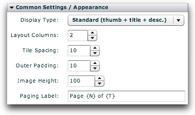
The Common Settings section of the Properties Panel contains several noteworthy parameters; they are described in the table below:
| Parameter name in Properties Panel | XML Property Name | Notes |
|---|---|---|
| Display Type | displayType | Specifies the type of tile which is created to represent each gallery. Supported default values are:
|
| Layout Columns | columns | Specifies the number of columns in the layout grid. |
| Tile Spacing | spacing | Specifies, in pixels, the spacing between each gallery tile. |
| Outer Padding | outerSpacing | Specifies, in pixels, the spacing between the designated bounds of the GallerySelector and the actual layout grid. |
| Image Height | imageHeight | Only applicable when using the 'Images / Thumb Only' display type above. In this case, specifies the allotted vertical image space (in pixels). |
| Paging Label | statusLabel | If there is more than one page of galleries, specifies the paging label displayed. Use {N} to represent the current page, and {T} to represent the total number of pages. |
Equivalement Class File
For detailed reference on this element, see the com.dwuser.ss4.ui.GallerySelector class in the API Reference.
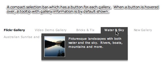
The GalleryBar provides a compact bar which allows gallery selection. It is designed to be on the same screen (layout view) as the main image display, removing any need for separate Images and Gallery Selection layout views. It rests unobtrusively at the top of the screen, providing more information only when hovered over.
The title of each gallery is displayed; when hovered over, more information is displayed in a tooltip. If needed, the items wrap to additional rows once the first row is filled.
The following image illustrates a GallerySelector in use within a slideshow:
Important Usage Notes
For a more expanded display, you can use the GallerySelector element for gallery selection.
When inserted, the element by default has a width 100%, which may make it seem to behave differently than other elements in Design View. You can change this if needed.
Noteworthy Parameters
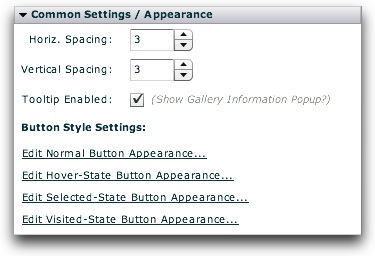
The Common Settings section of the Properties Panel contains several noteworthy parameters; they are described in the table below:
| Parameter name in Properties Panel | XML Property Name | Notes |
|---|---|---|
| Horizontal Spacing | horizontalGap | Specifies, in pixels, the horizontal gap (spacing) between each button on the bar. |
| Vertical Spacing | verticalGap | Specifies, in pixels, the vertical gap (spacing) between each button on the bar. |
| Tooltip Enabled | tooltipEnabled | Specifies if the popup tooltip with gallery information is shown when the user hovers over a button on the bar. |
| Edit Normal Button Appearance... | Controls the <GalleryBarButton> style selector settings | Opens a popup dialog where you can manipulate the appearance of the buttons in their standard 'up' state, including border / matte, opacity, color manipulations, and much more. |
| Edit Hover-State Button Appearance... | Controls the <GalleryBarHover> style selector settings | Opens a popup dialog where you can manipulate the appearance of the buttons when they are hovered-over, including border / matte, opacity, color manipulations, and much more. |
| Edit Selected-State Button Appearance... | Controls the <GalleryBarSelected> style selector settings | Opens a popup dialog where you can manipulate the appearance of the buttons in their selected state (when they represent the currently selected gallery), including border / matte, opacity, color manipulations, and much more. These settings override the Normal and Visited state, but are overridden by the Hover state. |
| Edit Visited-State Button Appearance... | Controls the <GalleryBarVisited> style selector settings | Opens a popup dialog where you can manipulate the appearance of the buttons in their visited state (when they represent galleries which have been already viewed), including border / matte, opacity, color manipulations, and much more. These settings override the Normal state, but are overridden by the Hover and Visited states. |
Equivalement Class File
For detailed reference on this element, see the com.dwuser.ss4.ui.GalleryBar class in the API Reference.
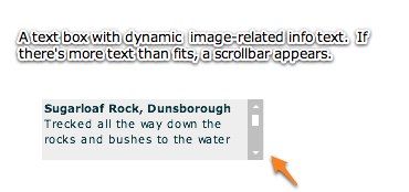
The DynamicScrollableText element displays scrollable text which dynamically changes based on the currently selected gallery and image (such as the image title or caption). If the text doesn't fit in the available/allowed area, a scrollbar automatically appears. When the text changes, it automatically fades between the old and new values. The DynamicScrollableText element is identical to the DynamicText element except that, if the text doesn't fit in the available area, the extra text can be scrolled into view on this element whereas it is hidden on the other element.
By default, the scrolling on the DynamicScrollableText element can be triggered with the keyboard shortcut of '<' (up) or '>' (down).
The most important property on this element is the Displayed Text value (the text attribute in the XML), which controls the text displayed. Note - you can use the htmlText property instead of text if you wish to display HTML text. The Text Formatting section of the Properties Panel controls the formatting of the element's text.
About Replacement Values
The DynamicScrollableText element has support for replacement values in its label. Replacement values are special string values which are automatically replaced based on the current gallery and image's information. The following gallery-related replacement values are available:
The following image-related replacement values are available:
Other less-common image-related replacement values are available too:
For all replacement values, you can use the following format to specify a default value: {image.property|Default Value Here} . Follow the property name with a pipe character (|) and the default value before the closing curly brace.
Note that you can use multiple replacement values in the same string.
Here is an example of a DynamicScrollableText element in use within a slideshow:
Important Usage Notes
This element is related to the DynamicLinkButton, Caption, and DynamicText elements. If you want a "pre-baked" display of the image caption and title, use the Caption element. On the other hand, this element can be used to display only one (caption or title) and customize the formatting on each separately.
If you want to display just the caption or title, you can also use the Plain Caption Text or Plain Title Text starter elements in the Special Starter Elements section.
Noteworthy Parameters
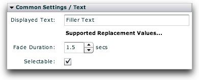
The Common Settings section of the Properties Panel contains several noteworthy parameters; they are described in the table below:
| Parameter name in Properties Panel | XML Property Name | Notes |
|---|---|---|
| Displayed Text | text | The text value displayed. Replacement values are supported. For more information about the replacement values, click the 'Supported Replacement Values...' link. |
| Fade Duration | fadeTime | Specifies the duration of the fade effect which is used to transition between different text values. |
| Selectable | selectable | Specifies if the text can be selected. |
Equivalement Class File
For detailed reference on this element, see the com.dwuser.ss4.ui.DynamicScrollableText class in the API Reference.
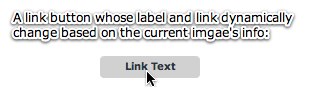
The DynamicLinkButton element creates a clickable link button whose text and link dynamically change based on the current selected gallery and image.
The two important properties on this element are the Label Text and Link URL properties. They control (respectively) the label displayed, and the link which is opened when the button is clicked.
The special property of the DynamicLinkButton element is its support of replacement values in the label and link. These are values which dynamically change based on the current image.
About Replacement Values
The DynamicLinkButton element has support for replacement values in its label. Replacement values are special string values which are automatically replaced based on the current gallery and image's information. The following gallery-related replacement values are available:
<The following image-related replacement values are available:
Other less-common image-related replacement values are available too:
For all replacement values, you can use the following format to specify a default value: {image.property|Default Value Here} . Follow the property name with a pipe character (|) and the default value before the closing curly brace.
Note that you can use multiple replacement values in the same string.
Here is an example of a DynamicLinkButton element in use within a slideshow:
Important Usage Notes
This element is related to the DynamicScrollableText, Caption, and DynamicText elements.
Noteworthy Parameters
The Common Settings section of the Properties Panel contains several noteworthy parameters; they are described in the table below:
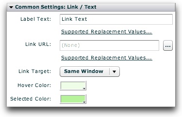
| Parameter name in Properties Panel | XML Property Name | Notes |
|---|---|---|
| Label Text | label | The label displayed on the link button. Replacement values are supported. For more information about the replacement values, click the 'Supported Replacement Values...' link. |
| Link URL | link | The link which is opened when the button is clicked. Replacement values are supported. For more information about the replacement values, click the 'Supported Replacement Values...' link. |
| Link Target | linkTarget | Specifies the window in which the link will be opened when the button is clicked. |
| Hover Color | rollOverColor | Specifies the color of the button's background/highlight when the user hovers over it. |
| Selected Color | selectionColor | Specifies the color of the button's background/highlight when the user clicks it. |
Equivalement Class File
For detailed reference on this element, see the com.dwuser.ss4.ui.DynamicLinkButton class in the API Reference.
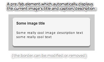
The Caption element displays both the current image's title and it's current caption value. It is designed to be a helpful starter element which can be customized further if you want different text displayed, or different formatting used to display the text.
If you wish only to change the caption formatting, you can use the Text Formatting section of the Properties Panel. However, this will not affect the title formatting. To customize the title value, you must use a custom descriptor as shown below.
The Caption element has the special features of default show/hide and resize effects, as well as automatic hiding when no image caption has been defined.
By utilizing a special feature known as Default Child Descriptors, the Caption element by default has the following child nodes inside of it (if none are explicitly specified):
<Caption>
<DynamicScrollableText htmlText="{image.title}" width="100%" fontSize="12" fontFamily="Arial" fontWeight="bold" />
<DynamicScrollableText maxHeight="200" htmlText="{image.caption}" width="100%" />
</Caption>
However, if you explicitly specify any child nodes, this default descriptor will not be used. Thus, when you want to further customize the Caption element, you can copy and paste the above code within the <Caption ... > ... </Caption> tags in Source View and make modifications as needed. See the DynamicScrollableText and DynamicText elements to learn more about how to modify those XML nodes.
Here is an example of a Caption element in use within a slideshow:
Important Usage Notes
This element is related to the DynamicLinkButton, DynamicScrollableText, and DynamicText elements. If you want a "pre-baked" display of the image caption and title, use the Caption element. On the other hand, the DynamicScrollableText and DynamicText elements can be used to display only one (caption or title) and customize the formatting on each separately.
You can use the CaptionToggleButton element (see Slideshow Control Buttons) to give the user the option of toggling the caption on and off.
If you want to display just the caption or title, you can also use the Plain Caption Text or Plain Title Text starter elements in the Special Starter Elements section.
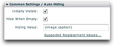
Noteworthy Parameters
The Common Settings section of the Properties Panel contains several noteworthy parameters; they are described in the table below:
| Parameter name in Properties Panel | XML Property Name | Notes |
|---|---|---|
| Initially Visible | outerVisible | Specifies if the caption element should initially be visible or hidden. A CaptionToggleButton can be used to allow hiding or revealing of the Caption element. |
| Hide When Empty | hideWhenEmpty | Specifies whether the caption should automatically hide itself when the 'Hiding Value' specified evaluates to an empty string. |
| Hiding Value | hideWhenEmptyValue | Specifies the string, which when evaluated to be empty, results in the caption automatically hiding itself. The string should contain replacement values. More information about this can be accessed by clicking the 'Supported Replacement Values...' link below. |
Equivalement Class File
For detailed reference on this element, see the com.dwuser.ss4.ui.Caption class in the API Reference.
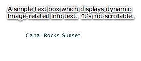
The DynamicText element displays non-scrollable text which dynamically changes based on the currently selected gallery and image (such as the image title or caption). If the text doesn't fit in the available/allowed area, it is cropped. When the text changes, it automatically fades between the old and new values. The DynamicText element is identical to the DynamicScrollableText element except that, if the text doesn't fit in the available area, the extra text is hidden on this element whereas it can be scrolled into view on the other element.
The most important property on this element is the Displayed Text value (the text attribute in the XML), which controls the text displayed. Note - you can use the htmlText property instead of text if you wish to display HTML text. The Text Formatting section of the Properties Panel controls the formatting of the element's text.
About Replacement Values
The DynamicText element has support for replacement values in its label. Replacement values are special string values which are automatically replaced based on the current gallery and image's information. The following gallery-related replacement values are available:
The following image-related replacement values are available:
Other less-common image-related replacement values are available too:
For all replacement values, you can use the following format to specify a default value: {image.property|Default Value Here} . Follow the property name with a pipe character (|) and the default value before the closing curly brace.
Note that you can use multiple replacement values in the same string.
Here is an example of a DynamicText element in use within a slideshow:
Important Usage Notes
This element is related to the DynamicLinkButton, Caption, and DynamicScrollableText elements. If you want a "pre-baked" display of the image caption and title, use the Caption element. On the other hand, this element can be used to display only one (caption or title) and customize the formatting on each separately.
If you want to display just the caption or title, you can also use the Plain Caption Text or Plain Title Text starter elements in the Special Starter Elements section.
Noteworthy Parameters
The Common Settings section of the Properties Panel contains several noteworthy parameters; they are described in the table below:

| Parameter name in Properties Panel | XML Property Name | Notes |
|---|---|---|
| Displayed Text | text | The text value displayed. Replacement values are supported. For more information about the replacement values, click the 'Supported Replacement Values...' link. |
| Fade Duration | fadeTime | Specifies the duration of the fade effect which is used to transition between different text values. |
| Selectable | selectable | Specifies if the text can be selected. |
Equivalement Class File
For detailed reference on this element, see the com.dwuser.ss4.ui.DynamicText class in the API Reference.