Download Help PDF (29MB) | Search:
The Title / Description / Tooltip tab is the most commonly used tab. This is where you specify the title and description/caption for the image. The image tooltip and reference ID can also be specified in this section. The tab appears as follows:
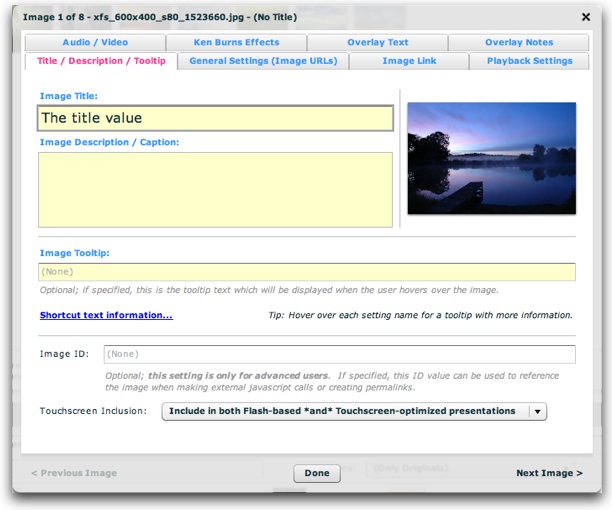
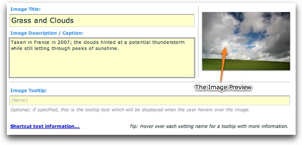
The most important values are the title and caption/description, which are described in more detail below. To the right of these settings, you'll see the image preview, which offers a quick preview of the image in question:
Before covering all of the options, it is important to note the availability of shortcut text (also known as "replacement values") which can be used in certain fields to reference values in other fields.
In the title, description, link, link target, and tooltip fields, you can add a shortcut to other properties and attribute values on the image.
The following image-related replacement values are available:
Other less-common image-related replacement values are available too:
For all replacement values, you can use the following format to specify a default value: {image.property|Default Value Here} . Follow the property name with a pipe character (|) and the default value before the closing curly brace.
Note that you can use multiple replacement values in the same string.
This table covers all of the options in this tab:
| Property | Description |
|---|---|
| Image Title | This is the title associated with the image. Along with the description/caption, these are generally the two most commonly used (and important) properties you'll set for each image. This is the title value which will be displayed in the slideshow's Caption element, or in any dynamic text element for {image.title} .
|
| Image Description / Caption | This is the description (or caption) associated with the images. Along with the title, these are generally the two most commonly used (and important) properties you'll set for each image. This is the description/caption value which will be displayed in the slideshow's Caption element, or in any dynamic text element for {image.caption} .
|
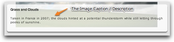
| Image Tooltip | This is the tooltip text which will be displayed when a user hovers over the image. For example:
Leaving the default blank value disables the tooltip. Note for advanced users: To customize the appearance of the tooltip, use the HTMLToolTip selector within the styles section of your XML configuration file. See the com.dwuser.ss4.ui.extras.HTMLToolTip class for more information about available properties. Note for advanced users: To references this value in other locations using shortcut text (replacement values), use {image.toolTip} . |
| Image ID | This optional setting is only for advanced users. It specifies a unique ID by which can be used to reference the image when creating permalinks or making javascript interface calls. As described in permalinks topic, specifying an ID makes it simple to link directly to a specific image in a slideshow. Note: Only letters, numbers and underscores may be used in this value. |
| Touchscreen Inclusion | [Added in Build 214+] By default, each photo will appear in both the standard Flash-based presentation and the touchscreen-optimized presentation. However, if you only want the slide to be included in one of those presentations (e.g. only the Flash-based presentation or only the Touchscreen-optimized presention), use this menu to make the slide touch-specific or desktop/notebook-specific. Note that this setting can be overridden on a gallery-wide level. |
The settings above map to the following XML attributes on each <img ... /> node:
| Property | Equivalent <img ... /> Attribute |
|---|---|
| Image Title | @title |
| Image Description / Caption | @caption |
| Image Tooltip | @toolTip |
| Image ID | @id |
| Touchscreen Inclusion | @touchEnabled and @flashEnabled -- in either case, use false as the attribute value. |
Note that the '@' is part of customary syntactical representation, and is not part of each attribute name.
For more detailed XML information, see the Developer Reference.