 Download Help PDF (29MB) | Search:
The main Touchscreen Content section is accesed by selecting the tab at the top of the wizard window:
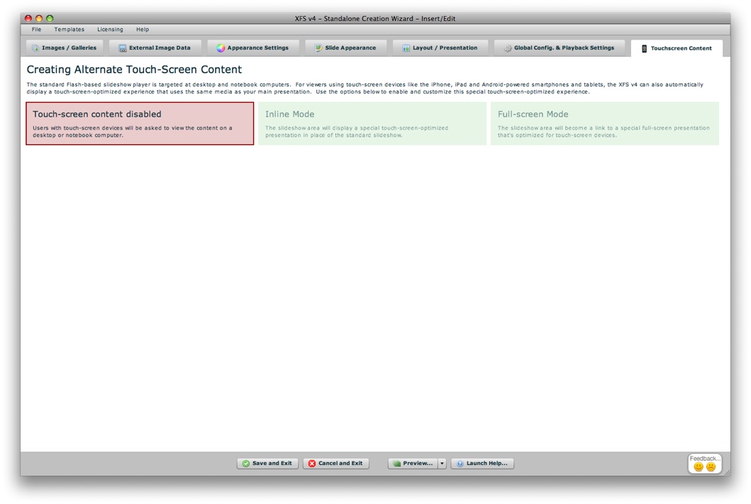
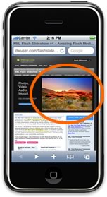
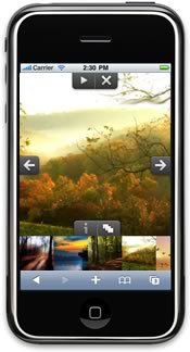
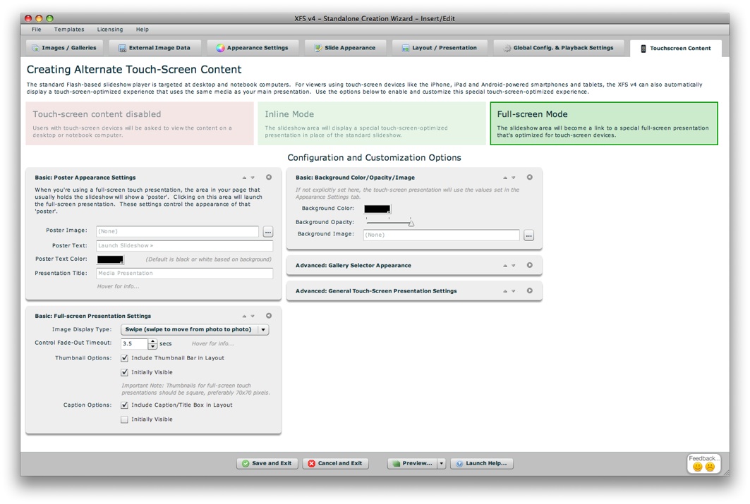
The Touchscreen Content section is where you will configure the alternate content to be displayed for touchscreen devices (including the iPhone, iPad and Android-based phones and tablets). This allows you to provide mobile visitors with a touch-optimized experience that is specifically targeted at their devices. Note that audio is not supported in touchscreen presentations and video support requires videos to be H.264 encoded for iOS and Android compatibility. The section appears as follows by default:
The three colored boxes at the top allow you to choose the Touchscreen Content Mode; click on a box to make a selection:
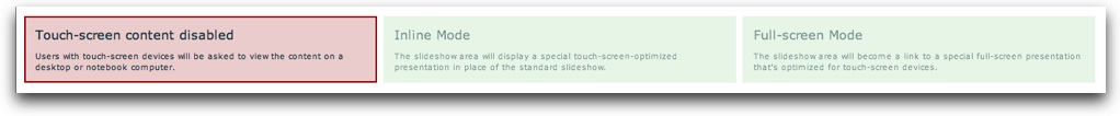
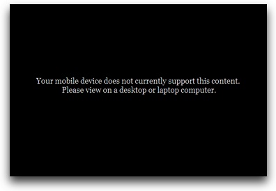
Three touchscreen content modes are available:

When the Inline Mode is selected, several option pods will appear below:
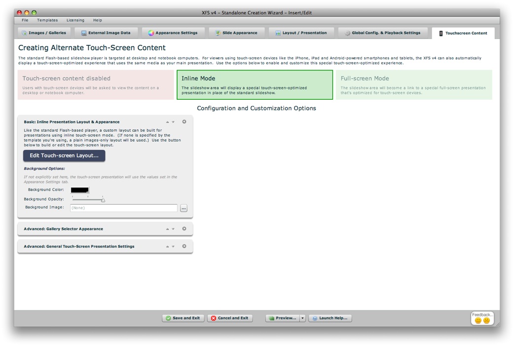
The Basic: Inline Presentation Layout & Appearance pod provides settings specific to the Inline touch mode:
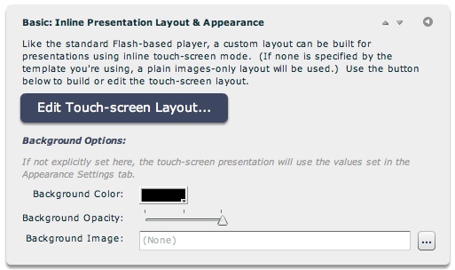
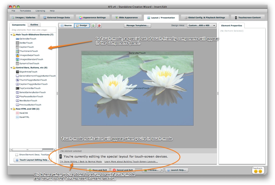
When creating inline touchscreen presentations, you can build a customized layout using a library of elements, just as is the case with the standard Flash-based presentation. This layout building takes place in the Layout/Presentation section, but must be accessed via the Edit Touch-Screen Layout button. This will activate Touch-Mode Layout editing and transfer you to the Layout/Presentation section:
To learn about building touchscreen layouts, reference the following topics:
Also available in this pod are background options: the background color, opacity and image. If these values are not explicitly specified, the standard values specified in the Appearance Settings tab are used instead.
The two other advanced setting pods (Gallery Selector Appearance and General Touch-Screen Presentation Settings), are detailed below.
When the Full-screen Mode option is selected, the following option pods appear:
The Basic: Poster Appearance Settings pod contains options that control the appearance of the poster; this the block that appears where the slideshow usually appears in your page, and when tapped takes users to the full-screen presentation:
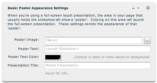
If you want to use an image for the poster, select one in the Poster Image field. The value specified in the Poster Text field will be overlaid over the image (if one exists). If a poster image has been defined, no text is included by default; if none has been defined, the default is Launch Slideshow » . The color of this text can be set via the Poster Text Color field. When the full-screen presentation is launched, you may want to customize the title displayed in the mobile browser; the Presentation Title field allows you to do this. If none is specified, the default value is Media Presentation. Technical details on these settings is available here, including information about specifying entirely-custom HTML poster content.
The Basic: Full-screen Presentation Settings pod contains basic option controls for the full-screen presentation:
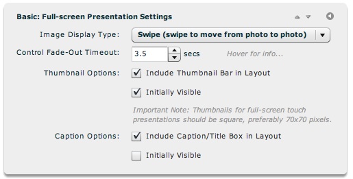
There are two Image Display Types supported - Swipe (which allows the user to move from photo to photo by brushing/swiping left and right), and Fade (which only shows one photo at a time, with a fade transition). Generally, the Swipe mode is best unless you're working with galleries with hundreds of photos, in which performance considerations may necessitate use of the Fade option.
The Control Fade-Out Timeout setting allows control over how quickly the controls will automatically fade away after user interaction ceases. By default, this occurs after 3.5 seconds; using a very large value (e.g. 9999 seconds) ensures that the controls never will automatically fade. Note that the user can manually toggle the controls by tapping on the presentation.
The Thumbnails Options let you choose if you want to include thumbnails in your fullscreen touch presentation or not, and specify if they should initially be visible or note (requiring the user to toggle them visible). The Caption Options provide the same type of options for the Title/Caption text display, which displays any Title and/or Caption text that has been specified for photos in the slideshow.
The Basic: Background Color / Opacity / Image pod lets you customize the background appearance used for the full-screen touch-optimized presentation:
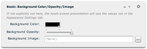
If not explicitly specified, the default values in the main Appearance Settings tab will be used instead. Note: It is generally recommended that you explicitly specify a black background when creating a touch-mode presentation; this usually looks best and also ensures a consistent user experience on touch devices, something especially important when targeting iOS devices such as the iPhone and iPad.
The two other advanced setting pods (Gallery Selector Appearance and General Touch-Screen Presentation Settings), are detailed below.
The advanced settings in the final two pods apply to both Inline and Fullscreen-mode touch presentations. First is the Advanced: Gallery Selector Appearance pod:
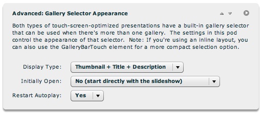
These settings control the appearance and behavior of the main built-in gallery selector. If you're using full-screen touch mode, this is the only gallery selection mechanism available. It is accessible via the gallery selection button that appears at the top of the full-screen presentation layout. If you're using Inline touch mode, you can either use the main gallery selector (accessible via a SelectGalleryButtonTouch element), or use a GalleryBarTouch element. The GalleryBarTouch element is like the GalleryBar element in standard Flash-based layouts, providing a compact way for users to select galleries based on their titles.
The Display Type option has two options. If Thumbnail + Title + Description is specified, each item in the selector will display the gallery's thumbnail image on the left, and the title and description on the right. If Thumbnail only is specified, only a large thumbnail image will be specified. If this latter option is used, gallery thumbnails should be at least as wide as the overall presentation width to avoid up-scaling. Initially Open lets you choose if the presentation should start directly with the first gallery (immediately displaying photos), or start with the gallery selector visible (requiring the user to make a gallery selection to begin the slideshow). Restart Autoplay allows you to specify if autoplay should always be (re)enabled whenever a new gallery selection is made.
Additional customization of the Gallery Selector is available via custom CSS; to learn more, see the Built-In Gallery Selector section of this topic.
The Advanced: General Touch-Screen Presentation Settings pod contains general options for touch-screen presentations:
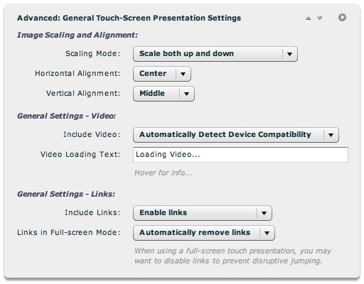
First are image scaling settings. These correspond to the same scaling options in the main Slide Appearance tab. By default, photos are scaled both up and down in touch mode. The alignment settings determine how photos will be aligned if they are larger or smaller than the available display area.
The Include Video option lets you automatically disable all video for a touch-screen presentation. Only some touchscreen devices support video usage in the presentations, and the video must be encoded for iPhone/iPad/Android display to be viewable (H.264/MP4 format). If your slideshow doesn't meet these qualifications or if there are performance issues on your target devices, you can use this setting to automatically remove any video slides from the presentation. Note that you could add special slides following any video slides in your galleries, and set these slides to be included only in the touch-mode presentation (via the Image Properties dialog). This would effectively create alternate content within those galleries to replace the video slides. The default setting allows for video to show on those devices that have good records of video compatibility; but this does not take into account whether your video has been properly encoded for iPhon/iPad/Android display. If video is enabled, the Video Loading Text option specifies what text should appear while video is initializing on certain devices that have a separate fullscreen video player (e.g. the iPhone).
You may not always want links enabled in touch-mode presentations. The Include Links setting lets you automatically remove links from all slides in a single click. The Links in Full-Screen Mode setting does the same, but applies only to full-screen mode presentations, and overrides the other setting. Links should almost always be disabled in full-screen mode, as it is easy to accidentally trigger a slide link while navigating the full-screen presentation.