 Download Help PDF (29MB) | Search:
The Slideshow Option Controls include several elements which are occasionally used to give control over various options.
Elements in this section:
Advanced Users / Developers: For more detailed developer-oriented information about every element in this section, be sure to see the API reference for each element's corresponding class.
Usage Tip: When in the wizard, hover over any property name in the Properties Panel for a detailed description of what the option controls.
Tip: All of the elements within this section can be placed in a HoverCanvas element, which makes them only visible when the user actively moves the mouse over the slideshow. See the HoverCanvas layout container for more.
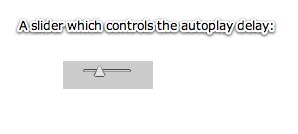
The AutoplayDelaySlider is a slider control which allows the user to adjust the autoplay delay between images. The Minimum and Maximum Delay parameters in the Properties Panel allow you to specify the possible delay range.
Equivalement Class File
For detailed reference on this element, see the com.dwuser.ss4.ui.controls.AutoplayDelaySlider class in the API Reference.
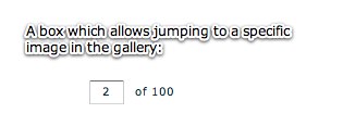
The GotoBox control element allows the user to type in the cardinal index of an image/slide and press 'enter' to jump directly to it. The control is made up of a TextInput box which displays the current image index, and a Label which displays the total number of images.
Equivalement Class File
For detailed reference on this element, see the com.dwuser.ss4.ui.controls.GotoBox class in the API Reference.
Note: Implementing this element requires code editing. Only use it if you are comfortable with editing the XML code.
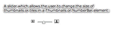
The PagingControlSizer element is a control which allows the user to resize the tiles in any element which extends PagingControlHolder, specifically the NumberBar and Thumbnails elements. It is often used in conjunction with the <PagingControls>...</PagingControls> child descriptor of the NumberBar or Thumbnails element as shown in the example in the class reference. For more on this use, see the PagingControls pseudo-property on the PagingControlHolder class. However, it can be used independently as long as the pagingOwner property has been set. For a code sample / example of this type of implementation, see the class reference.
Equivalement Class File
For detailed reference on this element, see the com.dwuser.ss4.ui.controls.PagingControlSizer class in the API Reference. As noted above, also see the com.dwuser.ss4.ui.PagingControlHolder class (the parent class of the Thumbnails and NumberBar elements).
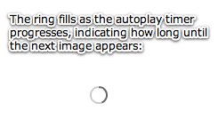
The AutoplayProgressDisplay element displays a small circle indicator which shows the autoplay timer progress. This allows the user to know how long until the slideshow automatically progresses to the next image.
Equivalement Class File
For detailed reference on this element, see the com.dwuser.ss4.ui.controls.AutoplayProgressDisplay class in the API Reference.