 Download Help PDF (29MB) | Search:
Image display elements are perhaps the most important class of elements which are added to a slideshow. These elements display all of the slides which you have added in the wizard or loaded from external data sources.
To use a physical analogy, your slideshow could be compared to a movie room. You might have some miscellaneous "elements," such as couches and chairs, which contribute to the overall atmosphere and make the experience more "usable." However, the centerpiece is the television screen on which the movies appear; this is comparable to the image display in your slideshow.
There are a number of different image display elements available. The most commonly used display is the ImagesStandard element; this provides a traditional slideshow visual experience. However, there is also the option of using more impressive and interactive 3D image displays. Most of these alternative displays are only available in the Pro version of the software.
Elements in this section:
*Important note about using the Pro-version-only image display elements:
When using the ImagesStarfield, Images3DWall, ImagesCoverFlow, or ImagesScatter image display elements, you must set the Slideshow Type to Professional in the "Slideshow Type - Pro or Basic" pod in the Global Configuration and Playback Settings section:
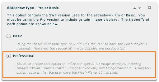
If you forget to change this setting, an "unable to render" message will be displayed when you attempt to view the slideshow.
Advanced Users / Developers: For more detailed developer-oriented information about every element in this section, be sure to see the API reference for each element's corresponding class.
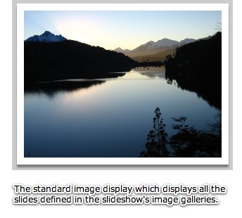
The ImagesStandard element is the most commonly used image display. All "image transition" settings throughout the wizard apply to slideshows which use this element. It provides a traditional slide display, with one slide visible at a time and a variety of transitions available to go from one slide to another. To learn about the available image transitions, see the Setting the Image Transition topic within Using the 'Global Configuration and Playback Settings' Section. In addition to setting the global default transition, you can also specify gallery- or image-specific transitions.
Here is an example of the ImagesStandard element in use within a slideshow:
Important Usage Notes
The actual size at which slide images appears depends on the size of the image display element (ImagesStandard in this case), as well as the Image Scaling Mode specified in the main Slide Appearance tab.
Noteworthy Parameters
(None)
Equivalement Class File
For detailed reference on this element, see the com.dwuser.ss4.ui.ImagesStandard class in the API Reference.
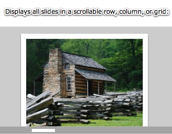
The ImagesScrollList elements is the second image display element available in the Basic version of the software. It is designed for situations when you want all slides to appear directly adjacent to each other. This allows the user to scroll through all slides at once, either manually or via hover-based movement. The images can be arranged in a scrollable row, column, or square grid.
Because all slides are displayed at once, this image display is best used with smaller galleries (e.g. 50 images or less). While you can use it with larger galleries, performance degradation may occur, especially on older systems.
Here is an example of the ImagesScrollList element in use within a slideshow:
Important Usage Notes
The actual size at which slide images appears depends on the size of the image display element, as well as the Image Scaling Mode specified in the main Slide Appearance tab.
If you want any content which overflows the defined element bounds to still be visible, disable the Clip Content Overflow setting (see the parameters table below for more information).
Noteworthy Parameters
The Common Settings section of the Properties Panel contains many noteworthy settings; they are described in the table below:
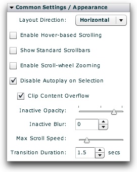
| Parameter name in Properties Panel | XML Property Name | Notes |
|---|---|---|
| Layout Direction | layoutDirection | Specifies how the slides should be arranged; supported values are Horizontal (the default; creates one long row of all slides), Vertical (creates one long column of all slides), and Grid (creates a large square grid of all slides). |
| Enable Hover-based Scrolling | useMouseScroll | Specifies if the user can scroll the entire layout grid by simply moving his/her mouse away from the center of the display. The downside to this scrolling method is that the user must actually click a slide to activate it. When this scrolling method is enabled, you generally will want to set Inactive Opacity to 1.0 and Inactive Blur to 0. If this setting is enabled, you can control the maximum scrolling speed through the Max Scroll Speed setting. |
| Show Standard Scrollbars | useScrollbars | Specifies if standard scrollbars should be shown, allowing the user to navigate the grid with scrollbars. |
| Enable Scroll-wheel Zooming | useScrollWheel | Specifies if the user can zoom in and out of the grid by using the mouse scroll wheel in order to gain a wider or narrower perspective. |
| Disable Autoplay on Selection | disableAutoplayOnClick | Specifies if autoplay should automatically be disabled/paused when the user manually selects a slide by clicking it. |
| Clip Content Overflow | clipContent | Specifies if any content which exceeds the specified bounds for the image display should be clipped (hidden) or not. |
| Inactive Opacity | inactiveOpacity | Specifies the opacity (alpha) of all slides which are not currently focused upon. This setting allows you to put all focus on the main slide by reducing the visual distraction of any other visible slides. Valid values range from 0.0 (fully transparent) to 1.0 (fully opaque). |
| Inactive Blur | inactiveBlur | Specifies the strength of the blur applied to all slides which are not currently focused upon. This setting allows you to put all focus on the main slide by reducing the visual distraction of any other visible slides. Leaving this value at its default, 0, disables the blur. |
| Max Scroll Speed | maxScrollSpeed | Specifies the maximum auto-scrolling speed when using mouse-based scrolling as enabled through the 'Enable Hover-based Scrolling' setting. This is the maximum distance the layout grid can move per update. The default value is 20 (pixels). |
| Transition Duration | duration | Specifies the duration of the automated transition between each slide (e.g. when autoplay is enabled). |
Important Note: For more information about all other parameters, including those not listed above and those not accessible through the Properties Panel, see the class reference mentioned below.
Equivalement Class File
For detailed reference on this element, see the com.dwuser.ss4.ui.ImagesScrollList class in the API Reference.
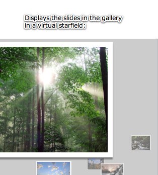
The ImagesStarfield element displays all slides within a virtual 3D starfield, with a flight-like effect to transition between slides. It is one of the Pro-version-only image display elements. Important: The Professional value must be selected for Slideshow Type when using it; see the note at the top of this topic for more information.
Because all slides are displayed at once, this image display is best used with smaller galleries (e.g. 50 images or less). While you can use it with larger galleries, performance degradation may occur, especially on older systems.
Here is an example of the ImagesStarfield element in use within a slideshow:
Important Usage Notes
The actual size at which slide images appears depends on the size of the image display element, as well as the Image Scaling Mode specified in the main Slide Appearance tab.
If you want any content which overflows the defined element bounds to still be visible, disable the Clip Content Overflow setting (see the parameters table below for more information).
Again, the Professional value must be selected for Slideshow Type when using this element; see the note at the top of this topic for more information.
Noteworthy Parameters
The Common Settings section of the Properties Panel contains many noteworthy settings; they are described in the table below:
| Parameter name in Properties Panel | XML Property Name | Notes |
|---|---|---|
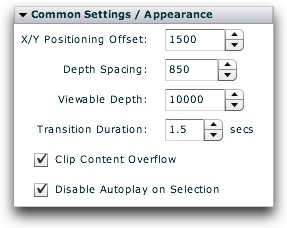
| X/Y Positioning Offset | positioningOffset | Specifies, in pixels, the maximum x and y offset of each slide from the center (the focal point). Increasing this value makes the slides appear more randomly distributed in the starfield. The default value is 1500. |
| Depth Spacing | depthSpacing | Specifies the z-depth spacing between each image in the starfield (in pixels). Increasing this value makes the slides seem farther apart and the starfield more vast. The default value is 850. |
| Viewable Depth | viewableDepth | Specifies the depth of the field of vision (in pixels). This controls the z distance behind the current slide which is visible, before it fades entirely away into the distance. The default value is 10000. |
| Transition Duration | duration | Specifies the duration of the automated transition between each slide (e.g. when autoplay is enabled). |
| Clip Content Overflow | clipContent | Specifies if any content which exceeds the specified bounds for the image display should be clipped (hidden) or not. |
| Disable Autoplay on Selection | disableAutoplayOnClick | Specifies if autoplay should automatically be disabled/paused when the user manually selects a slide by clicking it. |
Important Note: For more information about all other parameters, including those not listed above and those not accessible through the Properties Panel, see the class reference mentioned below.
Equivalement Class File
For detailed reference on this element, see the com.dwuser.ss4.ui.ImagesStarfield class in the API Reference.
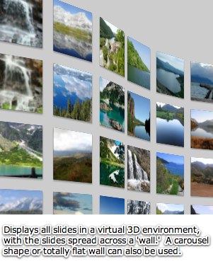
The Images3DWall element is a 3D image display where all images are laid out on a three dimensional "wall." The user can zoom in and out, drag the wall around, and focus in on single images. The wall can be curved, shaped like a wave, or even made into a circular carousel. It is one of the Pro-version-only image display elements. Important: The Professional value must be selected for Slideshow Type when using it; see the note at the top of this topic for more information.
The Images3DWall creates a large grid of all the current gallery's thumbnails and arranges them on the virtual 3D wall. When a thumb is clicked on, the camera flys in to focus on the image, and the full-quality image is loaded and displayed. If any video or audio have been added to the slide, they are played at this point. The user can click outside the slide's boundaries to return to the main overview, or use the scroll wheel to zoom back out.
This image display should be used in conjunction with the Preload Thumbs preloading mode setting (as set in the Global Configuration and Playback Settings section). This will ensure that all thumbs for the gallery are initially loaded before the user begins exploring the 3D wall.
Here is an example of the Images3DWall element in use within a slideshow:
Important Usage Notes
The actual size at which slide images appears depends on the size of the image display element, as well as the Image Scaling Mode specified in the main Slide Appearance tab.
If you want any content which overflows the defined element bounds to still be visible, disable the Clip Content Overflow setting (see the parameters table below for more information).
Again, the Professional value must be selected for Slideshow Type when using this element; see the note at the top of this topic for more information.
Noteworthy Parameters
The Common Settings section of the Properties Panel contains many noteworthy settings; they are described in the table below:
| Parameter name in Properties Panel | XML Property Name | Notes |
|---|---|---|
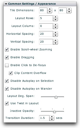
| Tile Dimensions | tileWidth | Specifies, in pixels, the width of each thumbnail tile on the 3D wall. |
| tileHeight | Specifies, in pixels, the height of each thumbnail tile on the 3D wall. | |
| Layout Rows | layoutRows | Specifies the number of rows of thumbs on the 3D wall's grid layout. This value is used to create a layout which is always the same height, but of variable width. It can be overridden by setting the Layout Columns property. The default value is 5. |
| Layout Columns | layoutColumns | Specifies the number of columns of thumbs on the 3D wall's grid layout. If set to a value greater than 0, this property overrides the Layout Rows property. Specifying a value on this property creates a layout which is always the same width, but of variable height. |
| Horizontal Spacing | horizontalSpacing | Specifies, in pixels, the horizontal spacing between each thumbnail tile on the 3D wall. The default value is 20. |
| Vertical Spacing | verticalSpacing | Specifies, in pixels, the vertical spacing between each thumbnail tile on the 3D wall. The default value is 20. |
| Enable Scroll-wheel Zooming | useScrollWheel | Specifies if scroll-wheel interaction is enabled. If enabled, the user can zoom in and out of the 3D wall using the mouse's scroll wheel. |
| Enable Dragging | useDrag | Specifies if the user can drag the wall around to change its relative position. If enabled, the user can drag the wall in order to see a different portion. |
| Enable Click to De-focus | useClick | Specifies if the user can click on an empty area to zoom back out from a slide, returning to the full-wall display. Keep in mind that if the user clicks on a different slide, they will zoom to that slide, not back to the full-wall display. |
| Clip Content Overflow | clipContent | Specifies if any content which exceeds the specified bounds for the image display should be clipped (hidden) or not. |
| Disable Autoplay on Selection | disableAutoplayOnClick | Specifies if autoplay should automatically be disabled/paused when the user manually selects a slide by clicking it. |
| Disable Autoplay on Wander | disableAutoplayOnWander | Specifies if autoplay should automatically be disabled/paused when the user wanders away from a slide by clicking in an empty area (to return to the full-wall display), dragging the wall to change its position, or using the scroll-wheel to zoom in or out. |
| Layout Degree Span | layoutDegreeSpan | Specifies the number of degrees spanned by the curve on the 3D wall's grid layout. Valid values range from -360 to 360; using negative values reverses the direction of the curve. Using a value of 360 or -360 makes a full circle, giving a carousel-like appearance. Using a value of 0 disables any curvature, making a flat wall. If you wish to make the wall curve back the opposite direction at the middle (giving a wave-like appearance), enable the Use Twist in Layout setting. The default value is 120. |
| Use Twist in Layout | layoutUseTwist | Specifies if the 3D wall's layout should include a "twist", or a reversal of curvature direction at the middle. See the Layout Degree Span setting for more information. When enabled, the wall curves one direction then curves back the other, giving a wave-like appearance. |
| Inactive Opacity | shadingOpacity | Specifies the opacity (alpha) of the non-active thumbnails when a certain slide is focused on. Valid values range from 0.0 (fully transparent) to 1.0 (fully opaque); the default value is 0.6. |
| Transition Duration | duration | Specifies the duration of the automated transition between each slide (e.g. when autoplay is enabled). |
Important Note: For more information about all other parameters, including those not listed above and those not accessible through the Properties Panel, see the class reference mentioned below.
Equivalement Class File
For detailed reference on this element, see the com.dwuser.ss4.ui.Images3DWall class in the API Reference.
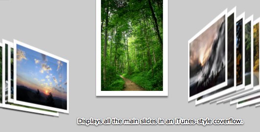
The ImagesCoverFlow element creates a coverflow display of all slides in the gallery, similar to an iPod® or iTunes® coverflow. If you're not familiar with what coverflows are, see the pictorial example shown below. It is one of the Pro-version-only image display elements. Important: The Professional value must be selected for Slideshow Type when using it; see the note at the top of this topic for more information.
Because all slides are displayed at once, this image display is best used with smaller galleries (e.g. 50 images or less). While you can use it with larger galleries, performance degradation may occur, especially on older systems.
This image display can be used in conjunction with any preloading mode setting (as set in the Global Configuration and Playback Settings section), but generally either Smart or Preload All should be used. You can also use either Preload Thumbs or 3D. For the very best performance, you should use low-quality version of the images for the main image source, and the regular high-quality images as the High Quality Image source. This will allow the low-quality images to quickly load, and when a user clicks on a specific slide in the coverflow, a higher-quality version will then be loaded and displayed. To learn more about specifying a separate high-quality image, see the Image Properties section.
Here is an example of the ImagesCoverFlow element in use within a slideshow:
Important Usage Notes
The actual size at which slide images appears depends on the size of the image display element, as well as the Image Scaling Mode specified in the main Slide Appearance tab.
If you want any content which overflows the defined element bounds to still be visible, disable the Clip Content Overflow setting (see the parameters table below for more information).
Again, the Professional value must be selected for Slideshow Type when using this element; see the note at the top of this topic for more information.
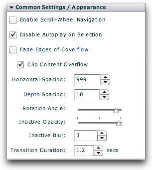
Noteworthy Parameters
The Common Settings section of the Properties Panel contains many noteworthy settings; they are described in the table below:
| Parameter name in Properties Panel | XML Property Name | Notes |
|---|---|---|
| Enable Scroll-Wheel Navigation | useScrollWheel | If enabled, the user can move from slide to slide in the coverflow by using the scroll wheel on the mouse. |
| Disable Autoplay on Selection | disableAutoplayOnClick | Specifies if autoplay should automatically be disabled/paused when the user manually selects a slide by clicking it. |
| Fade Edges of Coverflow | fadeEdges | If enabled, the slides closer to the edges (away from the current slide) will fade away. |
| Clip Content Overflow | clipContent | Specifies if any content which exceeds the specified bounds for the image display should be clipped (hidden) or not. |
| Horizontal Spacing | horizontalSpacing | Specifies the horizontal spacing, in pixels, between each slide in the coverflow. By default, this value is calculated to equal (Component Width) / 5. To use this default value, don't modify the value or set it to 999 (which triggers the calculated value). |
| Depth Spacing | verticalSpacing | Specifies the depth spacing between each slide in the coverflow; this setting allows you to make the out-of-focus slides fade into the distance. The setting is used in determining the z-position of each image. |
| Rotation Angle | rotationAngle | Specifies the angle at which each inactive slide in the coverflow is rotated. |
| Inactive Opacity | inactiveOpacity | Specifies the opacity (alpha) of the slides which are not currently focused upon. |
| Inactive Blur | inactiveBlur | Specifies the strength (in pixels) of the blur applied to slides which are not currently focused upon. To use no blur, set to 0. |
| Transition Duration | duration | Specifies the duration of the transition effect which occurs between slides. |
Important Note: For more information about all other parameters, including those not listed above and those not accessible through the Properties Panel, see the class reference mentioned below.
Equivalement Class File
For detailed reference on this element, see the com.dwuser.ss4.ui.ImagesCoverFlow class in the API Reference.
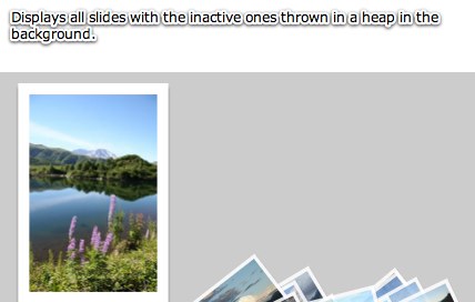
The ImagesScatter element scatters all slides in a gallery randomly across a virtual table. The slides are all positioned in the general area of the z-depth specified by the Inactive Z-Depth parameter, making them appear smaller. When one of the slides is clicked, it moves up into focus, displaying at its normal size. It is one of the Pro-version-only image display elements. Important: The Professional value must be selected for Slideshow Type when using it; see the note at the top of this topic for more information.
Because all slides are displayed at once, this image display is best used with smaller galleries (e.g. 50 images or less). While you can use it with larger galleries, performance degradation may occur, especially on older systems.
This image display can be used in conjunction with any preloading mode setting (as set in the Global Configuration and Playback Settings section), but generally either Smart or Preload All should be used. You can also use either Preload Thumbs or 3D. For the very best performance, you should use low-quality version of the images for the main image source, and the regular high-quality images as the High Quality Image source. This will allow the low-quality images to quickly load, and when a user clicks on a specific slide in the scatter, a higher-quality version will then be loaded and displayed. To learn more about specifying a separate high-quality image, see the Image Properties section.
Here is an example of the ImagesScatter element in use within a slideshow:
Important Usage Notes
The actual size at which slide images appears depends on the size of the image display element, as well as the Image Scaling Mode specified in the main Slide Appearance tab.
If you want any content which overflows the defined element bounds to still be visible, disable the Clip Content Overflow setting (see the parameters table below for more information).
Again, the Professional value must be selected for Slideshow Type when using this element; see the note at the top of this topic for more information.
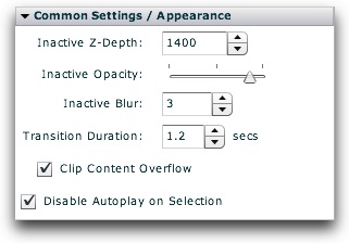
Noteworthy Parameters
The Common Settings section of the Properties Panel contains many noteworthy settings; they are described in the table below:
| Parameter name in Properties Panel | XML Property Name | Notes |
|---|---|---|
| Inactive Z-Depth | inactiveZ | Specifies the z-depth of the slides which are inactive. Use a larger value to make them seem farther away. |
| Inactive Opacity | inactiveOpacity | Specifies the opacity (alpha) of the slides which are not currently focused upon. |
| Inactive Blur | inactiveBlur | Specifies the strength (in pixels) of the blur applied to slides which are not currently focused upon. To use no blur, set to 0. |
| Transition Duration | duration | Specifies the duration of the transition effect which occurs between slides. |
| Clip Content Overflow | horizontalSpacing | If enabled, all content which doesn't fit in the defined dimensions will be clipped. If disabled, this overflow content will still be visible. |
| Disable Autoplay on Selection | disableAutoplayOnClick | If enabled, autoplay will automatically be disabled when the user clicks/selects a slide. |
Important Note: For more information about all other parameters, including those not listed above and those not accessible through the Properties Panel, see the class reference mentioned below.
Equivalement Class File
For detailed reference on this element, see the com.dwuser.ss4.ui.ImagesScatter class in the API Reference.