 Download Help PDF (29MB) | Search:
The Static Generic Elements are a group of non-changing generic elements which are helpful for building a slideshow user interface.
Elements in this section:
Advanced Users / Developers: For more detailed developer-oriented information about every element in this section, be sure to see the API reference for each element's corresponding class.
Usage Tip: When in the wizard, hover over any property name in the Properties Panel for a detailed description of what the option controls.
Advanced Users / Developers: Button Skinning
All of the buttons in this section can be skinned through the use of Custom Skin Files. See Custom Skin Files / Custom Buttons for more information. If you wish to only change the color of the button, change the Theme Color setting in the Properties Panel.
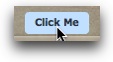
The LinkButton is a generic button with text and a rollover / select effect. It can have a custom click handler attached to it and be used to redirect to a different page or perform some other action. For example, you might use it to create a 'Site Homepage' button which redirects the user back to a different page.
The Label setting in the Property Inspector controls the button's text. The Click Handler setting controls what happens when the button is clicked; the handler will be Actionscript code. The default handler code is for a URL redirect (the URL just needs to be added).
Example element in use within a slideshow:
Equivalement Class File
For detailed reference on this element, see the mx.controls.LinkButton class in the API Reference.
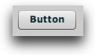
The Button element creates a simple button which can be used to control other settings or values. It can have a custom click handler attached to it and be used to redirect to a different page or perform some other action. For example, you might use it to toggle the visibility of some other element.
The Label setting in the Property Inspector controls the button's text. The Click Handler setting controls what happens when the button is clicked; the handler will be Actionscript code. The default handler code is for a URL redirect (the URL just needs to be added).
Example element in use within a slideshow:
Equivalement Class File
For detailed reference on this element, see the mx.controls.Button class in the API Reference.
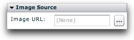
The Image element allows for a non-changing image or SWF to be displayed in the slideshow. For example, it can be a background image or a logo.
The URL of the video file (which can be a JPG, PNG, SWF, or GIF) is specified in the Image URL field in the Properties Panel. The URL must be relative to the HTML page holding the slideshow, and may be affected by loading security restrictions if loading from a different domain. The Browse button ('...') can be used to select a file directly:
Example element in use within a slideshow:
Equivalement Class File
For detailed reference on this element, see the com.dwuser.ss4.ui.Image class in the API Reference.
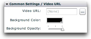
The FlexVideoPlayer element allows for a separate video (which is not associated with any image) to be displayed within the slideshow. This element should be rarely used. Note that it is NOT needed and totally unrelated for playing video associated with a specific slide.
The URL of the video file (which can be an FLV, MPEG4 Hi-Def (H.264), or an RTMP streaming URL) is specified in the Video URL field in the Properties Panel. The URL must be relative to the HTML page holding the slideshow, and may be affected by loading security restrictions if loading from a different domain. The Browse button ('...') can be used to select a file directly:
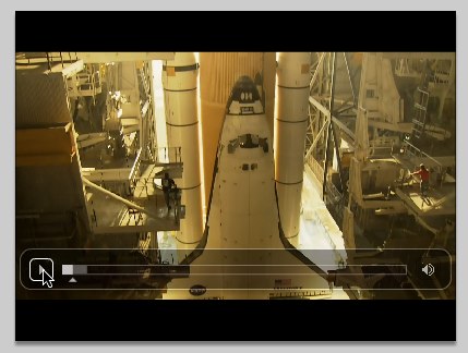
Example element in use within a slideshow:
Equivalement Class File
For detailed reference on this element, see the com.dwuser.ss4.video.FlexVideoPlayer class in the API Reference.
The Label element displays a single-line label which contains non-changing text. For example, you might use it for a slideshow title (e.g. 'My Portfolio').
The Displayed Text setting in the Property Inspector controls the button's text. You can manually edit the htmlText property if you want to include HTML; if editing the XML directly, you must encode all HTML.
Example element in use within a slideshow:

Equivalement Class File
For detailed reference on this element, see the mx.controls.Label class in the API Reference.
The Text element displays a label which contains non-changing text. It differs from the Label element in that it supports multiple lines of text. For example, you might use it for an "about-me" description paragraph.
The Displayed Text setting in the Property Inspector controls the button's text. You can manually edit the htmlText property if you want to include HTML; if editing the XML directly, you must encode all HTML.
Example element in use within a slideshow:
Equivalement Class File
For detailed reference on this element, see the mx.controls.Text class in the API Reference.