 Download Help PDF (29MB) | Search:
Image progress loaders are included in a slideshow to show the progress of image loading, so that the user knows the status of loading operations.
Elements in this section:
Advanced Users / Developers: For more detailed developer-oriented information about every element in this section, be sure to see the API reference for each element's corresponding class.
Usage Tip: When in the wizard, hover over any property name in the Properties Panel for a detailed description of what the option controls.
General Notes About Image Progress Loaders
You will usually want to place all loading indicators in an Overlay view (see Understanding and Managing Layout Views) so that they are always visible to the user.
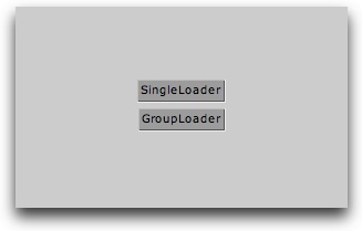
The Centered Loaders Block is a special starter element which is comprised of a VBox which holds both a centered SingleLoader and GroupLoader element. Regardless of your slideshow configuration, this element can be dropped into an overlay view to ensure that loading progress information is displayed. If you are loading images one-by-one, the SingleLoader will automatically be used; if you are using a group-preload, the GroupLoader will automatically be used.
After dropping the element into an Overlay view, you will want to make sure in the Size / Positioning section of the Properties Panel that the X and Y values are set to 0 and the Width and Height set to 100%. This will ensure that the loaders are centered over the slideshow when they appear.
Important Usage Notes
See element description; additionally, be aware that all the individual elements which comprise a starter element can be individually edited after the starter element has been added.
Noteworthy Parameters
(For specific parameters, see the SingleLoader and GroupLoader elements below; this starter element contains both of these loading indicator elements.)
Equivalement Class File
This is a compound starter element made up of other elements; it has no individual associated class file.
The Layout XML for the starter element is as follows:
<VBox x="0" y="0" width="100%" height="100%" horizontalAlign="center" verticalAlign="middle">
<SingleLoader />
<GroupLoader />
</VBox>
The SingleLoader element displays the progress of all individual-image loading operations. When a single image begins to load, it automatically appears; when the load completes, it automatically hides. The appearance of the loader can be customized; see the Noteworthy Parameters below for more information. Here is an example of the element in use within a slideshow:

To ensure that the progress indicator is always visible when loading takes place, it is recommended that you place it in an Overlay layout view.
Important Usage Notes
It is usually best to include both SingleLoader and GroupLoader progress indicator elements in your slideshow. Then, if at some point the loading method is changed, loading progress will still be shown. You can save time and use the Centered Loaders Block starter element, which includes both loaders in a centered container. See above for more information about this starter element.
In addition to the parameters listed in the Noteworth Parameters table below, there are many other settings which can be used to customize the appearance of the loader. Some of these are included directly in the Properties Panel; others are described in the SingleLoader class file referenced below.
Noteworthy Parameters
The Common Settings section of the Properties Panel contains many noteworthy settings; they are described in the table below:
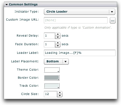
| Parameter name in Properties Panel | XML Property Name | Notes |
|---|---|---|
| Indicator Type | type | This specifies the type of indicator shown. Supported options include:
|
| Custom Image URL | customImageURL | If Custom Animation is selected as the Indicator Type, this value specifies the URL to the custom loading indicator image/animation which will be displayed. The file can be a JPEG, PNG, SWF, or GIF. The URL must be relative to the HTML page holding the slideshow; use the browse button ('...') to automatically generate an appropriate URL. If you attempt to load content from another domain, you may be affected by Flash Player cross-domain loading security restrictions. |
| Reveal Delay | showDelay | By default, the loader doesn't immediately appear when a load starts. Instead, there is a short delay (1 second by default) which ensures that the loader isn't constantly flashing in and out for short loads. In other words, the loader will only appear if the load takes more than the time specified by Reveal Delay. A shorter value may make the loader appear more often, whereas a longer value may confuse users because they won't know what's happening. |
| Fade Duration | fadeTime | When the loader appears and disappears, a fade effect is automatically applied. This parameter specifies the duration of thes effect. |
| Loader Label | baseLabel | Specifies the label displayed on the loader. To disable the label, enter an empty string or a single space. If {P} is used within the label, it will be automatically replaced with the percentage of loading which has completed. For example, the default label of "Loading Image...{P}%" displays "Loading Image...50%" when a load operation is halfway complete. |
| Theme Color | themeColor | Specifies the base color used for the loading indicator. |
| Circle Size | innerRadius | If using a Circle Loader as the Indicator Type, specifies the size of the loading indicator. |
Important Note: For more information about all other parameters, including those not listed above and those not accessible through the Properties Panel, see the class reference mentioned below.
Equivalement Class File
For detailed reference on this element, see the com.dwuser.ss4.ui.SingleLoader class in the API Reference.
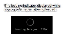
The GroupLoader element displays the progress of all image-loading operations when more than one image is being loaded. When a group of images begins to load, it automatically appears; when the load completes, it automatically hides. The appearance of the loader can be customized; see the Noteworthy Parameters below for more information. Here is an example of the element in use within a slideshow:
To ensure that the progress indicator is always visible when loading takes place, it is recommended that you place it in an Overlay layout view.
Important Usage Notes
It is usually best to include both SingleLoader and GroupLoader progress indicator elements in your slideshow. Then, if at some point the loading method is changed, loading progress will still be shown. You can save time and use the Centered Loaders Block starter element, which includes both loaders in a centered container. See above for more information about this starter element.
In addition to the parameters listed in the Noteworth Parameters table below, there are many other settings which can be used to customize the appearance of the loader. Some of these are included directly in the Properties Panel; others are described in the GroupLoader class file referenced below.
Noteworthy Parameters
The Common Settings section of the Properties Panel contains many noteworthy settings; they are described in the table below:

| Parameter name in Properties Panel | XML Property Name | Notes |
|---|---|---|
| Indicator Type | type | This specifies the type of indicator shown. Supported options include:
|
| Custom Image URL | customImageURL | If Custom Animation is selected as the Indicator Type, this value specifies the URL to the custom loading indicator image/animation which will be displayed. The file can be a JPEG, PNG, SWF, or GIF. The URL must be relative to the HTML page holding the slideshow; use the browse button ('...') to automatically generate an appropriate URL. If you attempt to load content from another domain, you may be affected by Flash Player cross-domain loading security restrictions. |
| Reveal Delay | showDelay | By default, the loader doesn't immediately appear when a load starts. Instead, there is a short delay (1 second by default) which ensures that the loader isn't constantly flashing in and out for short loads. In other words, the loader will only appear if the load takes more than the time specified by Reveal Delay. A shorter value may make the loader appear more often, whereas a longer value may confuse users because they won't know what's happening. |
| Fade Duration | fadeTime | When the loader appears and disappears, a fade effect is automatically applied. This parameter specifies the duration of thes effect. |
| Loader Label | baseLabel | Specifies the label displayed on the loader. To disable the label, enter an empty string or a single space. If {P} is used within the label, it will be automatically replaced with the percentage of loading which has completed. For example, the default label of "Loading Image...{P}%" displays "Loading Image...50%" when a load operation is halfway complete. |
| Theme Color | themeColor | Specifies the base color used for the loading indicator. |
| Circle Size | innerRadius | If using a Circle Loader as the Indicator Type, specifies the size of the loading indicator. |
Important Note: For more information about all other parameters, including those not listed above and those not accessible through the Properties Panel, see the class reference mentioned below.
Equivalement Class File
For detailed reference on this element, see the com.dwuser.ss4.ui.GroupLoader class in the API Reference.